https://noroff.bravais.com/document/11634/preview
A well-created logo is a visual brand mark that shows who the company is, as well as its positioning. A logo can consist of a symbol or brandmark and/or a logotype, often with a tag line.
Look at the mood board you created in the previous lesson task and use it for inspiration to create a logo for the fitness coaching brand. You are free to choose whether you want to add a tagline or not.
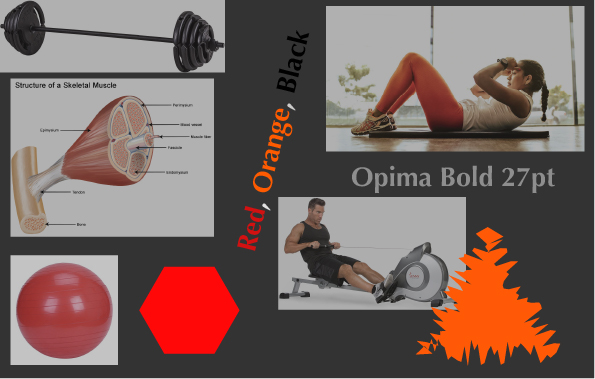
My mood board from a while ago
This was my mood board and in the end, I didn’t use too much about it. Read on to see how it went.

Now, you may ask why I chose a boar to be the logo for a fitness coaching center. Well, I connected “strength” and getting stronger, to the Greek god Ares. Ares´s sacred animal is the boar (among other animals) and boars are known to be strong and wild. You don´t mess with boars. Since there was no real info about the fitness center I had made a mood board a week or so ago I made up a lot. I let myself get creative and see if a boar could make a logo.
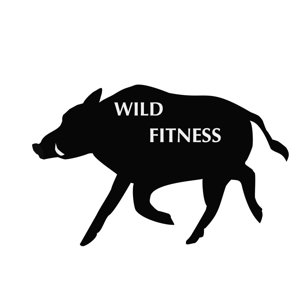
When I made the logo I noticed that it would get even more simplified. It didn’t need any colors, just the white and black shades. So I used that. In the end, my mood board was only used as a tiny guideline. I used black and white but red and orange became unnnessecary. I have motion in the logo, like the mood board showed two people exercising, but there was no typical “workout” in the logo. Just a running boar. The triangle got used, like with the hooves, tusk, tail, and ear, but not the hexagon. I used the font I had used in the mood board though, it fits.
The logo is fairly simple and honestly, a fitness coaching brand would maybe appreciate that. The focus is then on the brand name and the logo is just the frame. It simply becomes a way for people to remember the brand by. Many fitness brands use predators as symbols. Animals like tiger, lion, wolf, but this fitness brand stands out. It uses the hidden danger in the forest. The boar. The symbol of Ares/Mars. The strong wild pig.
