https://noroff.bravais.com/document/11459/preview
FunFact, I got started on this assignment earlier than planned because the fire alarm woke me up 3 hours earlier than when I usually get out of bed.
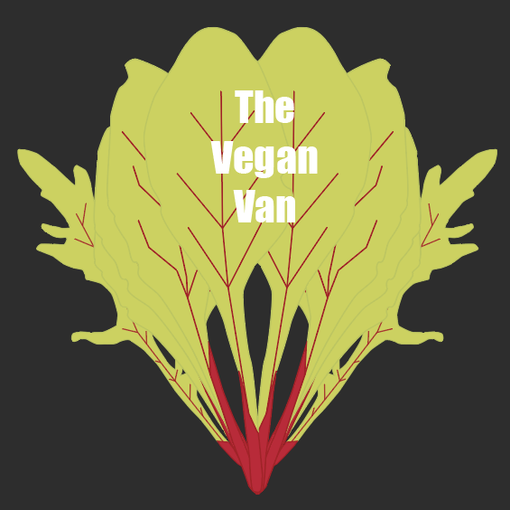
Name of establishment: The Vegan Van Background: Out with French fries and greasy burgers – there’s a new takeaway food joint on the block (and it’s on wheels!)
The Vegan Van is a food truck venture started by two culinary students during their studies. Yuccies generally enjoy a healthy lifestyle. They want the speed and convenience of fast food but don’t want to compromise on nutrition. Lately, the transmission of viruses and bacteria has stepped into the foreground, and people are hesitant to sit in traditional restaurants. That’s exactly why these students decided to join the booming food truck industry. Not only are their meals delicious, healthy, fresh, and organic – they also place special focus on ingredients that have immune-boosting effects. Think poké bowls, smoothies, ginger shots, farm-to-table salads, and a range of delicious soups to battle the winter cold.
I chose to post this as a summary of my course assignment. My assignment is to make a logo for a food truck selling vegan food only.
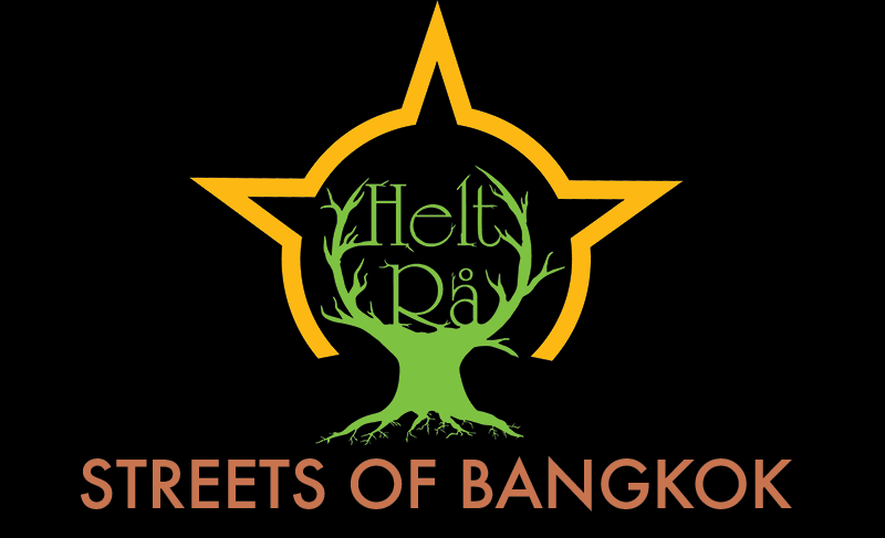
I first began to look after “competitors” for vegan food trucks. https://www.visitoslo.com/no/artikler/foodtrucks/ Two food trucks in Oslo that have vegan food on their menu are Helt Rå and Gillikin´s Puffs. I also looked at vegan and vegetarian restaurants in Oslo to see how their logos looked like. I used a blog for that, https://theculturetrip.com/europe/norway/articles/the-best-vegetarian-and-vegan-restaurants-in-oslo/.
Okay, when I looked at the logo of Helt Rå I felt both jealous and impressed. They really laid heavily that their food is wild, epic and in this case vegan/vegetarian friendly. The logo features a green tree-stump that leads up to the name of the company. It also faintly looks like a deer. The whole thing is surrounded by a yellow circle that has three points. Epic. From my observations, Helt Rå has meals inspired by food from Bangkok.
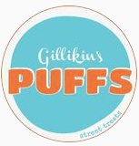
Gillikin´s Puffs had a cute logo. It is in the form of a circle and has two different fonts, just like Helt Rå Streets of Bangkok. It is in the color schemes of pastels instead of the harch one Helt Rå has and it fits the pastries they sell. From what I can see they sell sweet things.
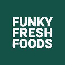
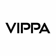
This is what I found in the restaurants. Funky Fresh Foods seems to not have a proper logo outside of their name in a nice font and colors. Simple and straight to the point. Nordvegan has a comfortable logo that states their name and with a pretty leaf. The Fragrance of the Heart isn’t exactly purely vegan, it is vegetarian, but the logo was still important to look at. the cafe has the logo of a coffee cup that is a heart with steam rising. Very elegant looking. The Vippa food court has vegan and vegetarian food that they serve by the port. There is no standard logo from what I can see on their Facebook page. Unless the sanserif Vippa in black and white is their logo. This website was helpful trying to find restaurants, https://theculturetrip.com/europe/norway/articles/the-best-vegetarian-and-vegan-restaurants-in-oslo/


The Vegan Van should have a logo that reflects the lifestyle they are trying to sell. Fresh, healthy, and convenient (simple). That leaves frilly, elegant, and cute almost out immediately. It needs to be simple to read and understand, plus, a café and food truck are vastly different. The Vegan Van is fast food and it needs to be visible in the logo alone.
This leaves logos like Helt Rå, Nordvegan, Funky Fresh Foods, and Vippa. 3 out of 4 have no serifs and is very easy to read. Thus my Vegan Van logo should go in that direction to send the vegan and Yucchi signals off. However, it has to be unique so I must balance having it fit into the “genre” but also stand out. So, my idea is a circular logo in an eye-catching color with the name in sanserif.
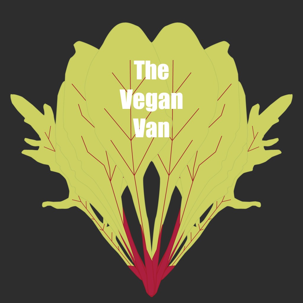
My color choices are green, yellow, red. I will only use these as well as black and white.
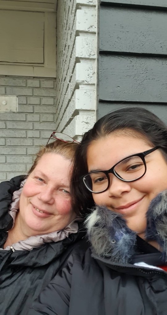
I might not use all of them but these are the color limitations I have put for myself. My mom and I worked together to make sketches and come up with ideas. Some weird ideas and some fun ones.
We came up with all these ideas together after we could go back into our home after the fire alarm had gone off. That is why we look so tired in this pic by the way.
One of mom´s sketches included the leaf of a plant that is poisonous… so we might have to change that.
Now, my target group is Yucchie´s (Young urban creatives) with a budget that caps at 180 NOK´s for some food. It is the group of those who want things modern and politically correct. So, I have to reach them, but what are their characteristics beyond what I mentioned? Well since I live in Oslo myself I know of some of the places where food trucks are used frequently.
Yuuchie´s want things to be convenient and cheap. They just want the food fast and to be able to have it when they want. So, I must advertise The Vegan Van as practical. So, having the logo look “quick” would be a plus. Yucchie´s want things eco friendly etc, so the logo must scream that The Vegan Van is… vegan and so on. Therefore leaves, flowers, and other greenery would be good to have on the logo. A design challenge can be to make these components fit together and not look like a tire got attacked by a plant.
What makes logos successful? Well, just like with flags the easier it is to draw the better. If the logo is too complicated for the average person to draw and show their friend it is not good for the company. If a person wants to tell their friends about our food truck they need to be able to tell their friends about it by describing it.
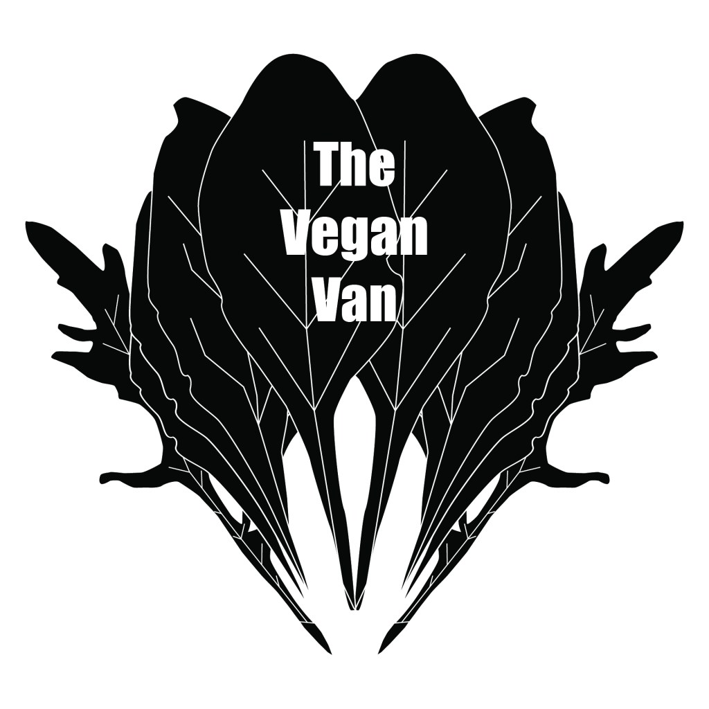
I wondered how to make my files both RBG, CMYK, and Black-White, but a video on Youtube cleared some confusion up, https://www.youtube.com/watch?v=K0QwbtsxgYE.
I brainstormed some more for almost a week to try and see if I could make my logo ideas even simpler. Then it came to me. I could just have a leaf with some text on where part of the letters are vegetables. Or just have a couple of leafy greens with text? Why didn’t I think of this earlier?
So I took note of this idea and went back to sleep because it was way too early to start working. Then I had some fun researching and then went to shower. My best ideas comes in the shower… and then, the firealarm went off again! As I stood there cold and wet outside in the snow I got a bout of inspiration. To further this inspiration I went to the mall to look at some more logos. Narvesen, Vita, Specsavers, The Body Shop, Bakeriet, Dress Man, Vinmonopolet etc. I had to simplify my whole idea, but also make it grand.
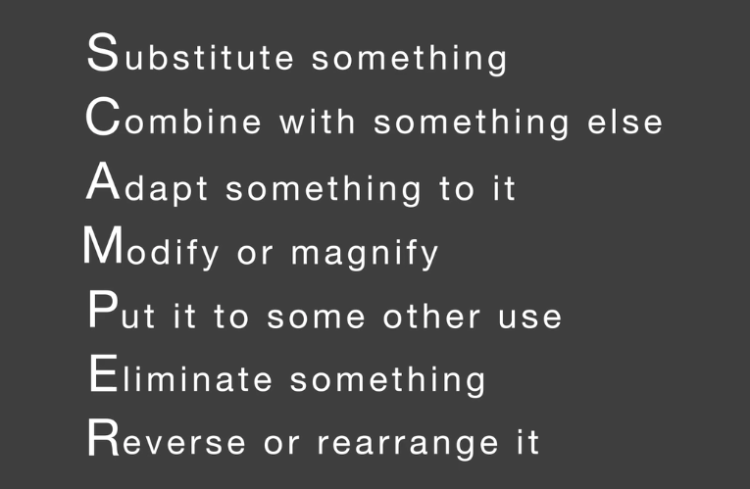
Now it is time for SCAMPER
I combined the different leafy greens instead of only choosing 1 type. I eliminated certain aspects of the original idea. (Example: To add vegetables to the logo would only clutter it) I also rearranged the salad I had started with to see if anything looked better than the original idea.
The other parts of SCAMPER just didn’t work or would be redundant to do.
I got help from some friends towards the end. They commented on my logo and gave me tips on how to improve. I had not noticed that the red was a little to sharp for example, so I dulled it down.