Lesson Task 1: Introduction to Illustrator and Photoshop
I was tasked with making 10 art boards in both Illustrator and Photoshop, adjusting my workspace, and then showing it off. Well, here it is:


When it comes to colors, drawing, and tool setup, I might prefer Illustrator. BUT, Photoshop has the handy way of just clicking on the ONE artboard I want to draw on instead of them all kind of being connected. After all these years I might go back to Photoshop for drawing now that I know more about how to use the program.
Lesson Task 2.1: Find the contrast, emphasis, and balance
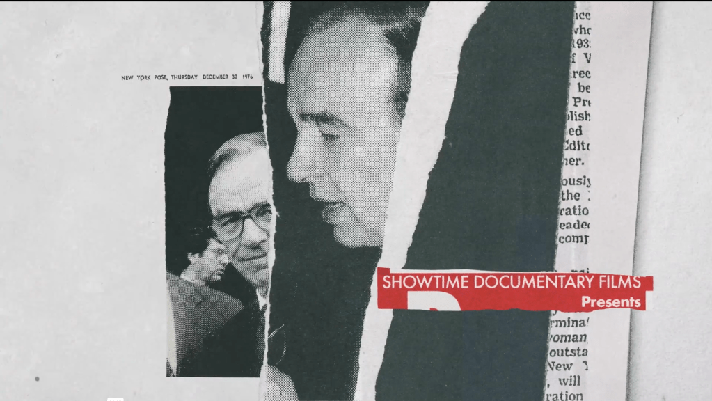

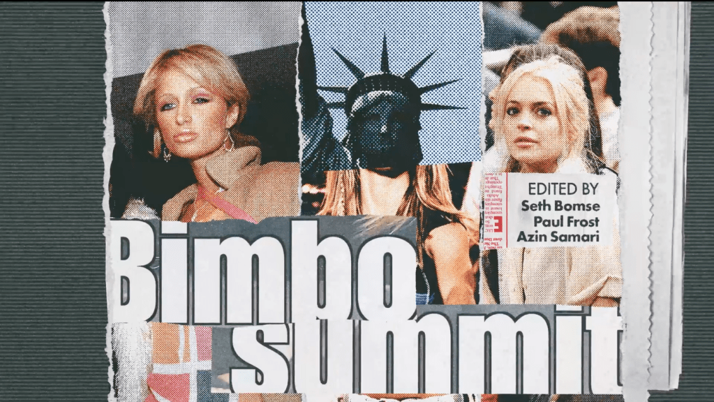

I noticed that the video put a lot of contrast with color. Most of it is greyscale except for lines of red. Then there is a lot of emphasis on certain article clip-outs by having big headlines, so also a size contrast. The last picture (7) has a different sort of color contrast by making it blue and yellow. However, it also has the size and font contrast in comparison to the rest of the picture.
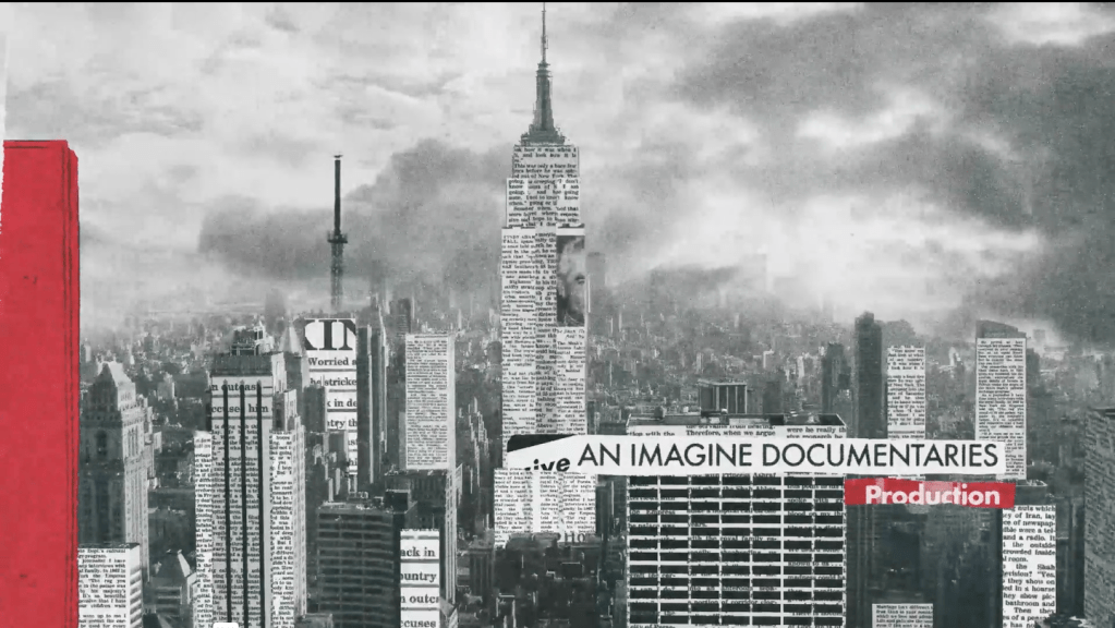
The emphasis is also that the important headlines are not in a small article-text style but rather thick and bold, so it stands out. There is also an emphasis on “worried” on picture 5 where the face of the worried man stands out since there is not face. It is also a lot more white than the rest of the picture.
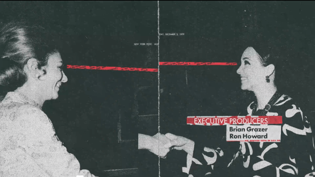
Then there is also balance in the 2nd picture where the red on the left balances out the red on the right side. Then on the 3rd picture, the page is balanced by having two similar images on each side of the page. Then there is balance on the 6th picture where three people is spread out over three columns.
Lesson Task 4: Scoops logo new color scheme
Task: Your colleague is struggling to colour their artwork. They’ve asked you to help and create a colour palette based on the lessons you’ve learnt. The client wants a unique colour palette that doesn’t exist on any trending colour websites, so it’s up to you to build a palette from scratch!
I was heavily inspired by Pop Art colors, since they are the ones that grab attention and in this case, look fresh, inviting, cold, fun, and on-theme. Instead of greyscale it is now pink, yellow, and blue.

