Lesson Task 1.1
If I had a time machine and could choose any time period in animation history to go back to, I would choose the 1930s in USA, because Steamboat Willie is one of my favorite animations. That along with Fantasia, though that was 1940. I want to learn how they did those animations and they themselves learned how to do them. So, I want to understudy Walt Disney as he and the people doing similar things, tried to make a name for themselves in motion graphics.


Thanks to the animations created in that time period, animation bloomed and has both synchronized audio, and fluid animation.
I vividly remember the feelings that Steamboat Willie and Fantasia evoked, it is strong emotions. It is an animation that is memorable and beautiful in two very different ways. I like the illustrative look the animations has, and while the newer Dinsey movies are good as well, I like the old-school style even though it might be obvious with some of its animations. For example, highlight the book that will be taken from the bookshelf.
Steamboat Willie was THE short animation that kickstarted synchronized sound and animation, which is why it is the dominant form of animation now.
Lesson Task 1.2
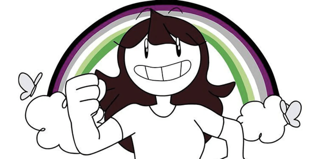
The freelance animator I love to watch is Jaiden Animations on Youtube. Jaiden specializes in 2D digital animation and is from Arizona, USA.
She has an art style that is so “simple” and yet so engaging. She keeps the colors minimal and the details she has almost always have a significant meaning in the storytelling. However, the details are sometimes just there to immerse the viewer into the world she is telling, like using real Japanese when drawing a busy Japanese street she was in.
This is one of her more detailed works where she made herself an anime intro.
However, this is more of her usual style.
I deeply respect her work since she clearly puts a lot of effort into both telling the story in a funny way, but also having her animation speak for itself. Her animation also doesn´t feel cluttered… unless she wants it to look that way.
Lesson Task 1.3
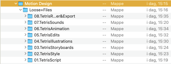
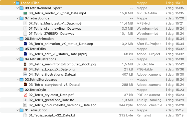
I was given the task of organizing the files of some sort of “Happy Birthday Tetris” project. The files were a mess and I was tasked with giving names and file groups that made sense.
This is how I wound up doing it, not completely following the formula given by the school, but I did my best… I honestly didn´t open each and every file. I mostly used the names already given to guess where they would fit.

Lesson Task 1.4
Task: You are a concept artist, and the director of their new TV commercial has asked you to explore some style tests. They don’t want to stifle your creativity, so they have asked you to pick any simple object and illustrate it in three unique ways.
Okay. I am laying myself flat. I did not make a simple object like a reasonable person. Oh no, I made a rearing horse. Ranging from Pretty Darn Realistic, to, My Little Pony cartoon style. I tbh prefer the MLP cartoon style since the other two were a bit difficult, especially if I wanted to make an animation in that style.
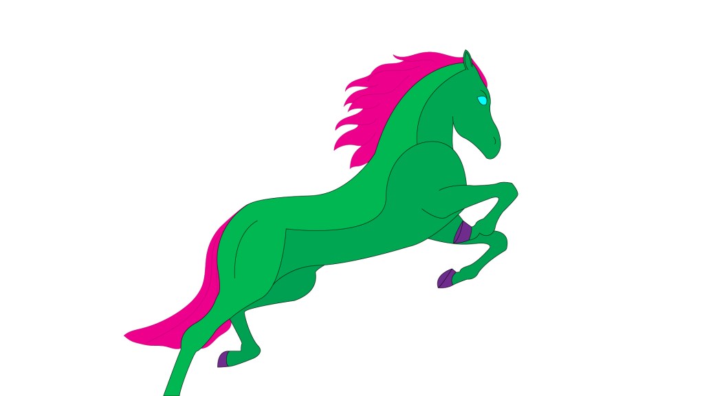

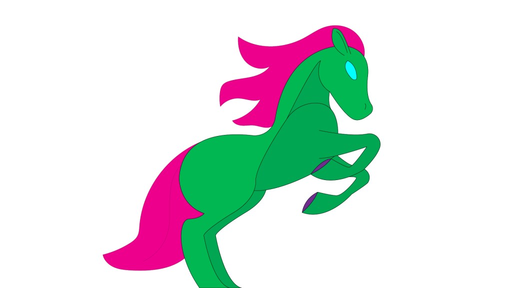

I had a reference picture I went with and it is quite amazing how one picture could lead to three or more styles. The reference picture was from of konradbak on Adobe Stock.
Now you might wonder why my horse is green and pink… eh I just found a cool Kid´s swatch in Illustrator since I wanted a colorful magic horse, and this was just a fun swatch that reminded me of the main character in an anime I love.
