Lesson Task 1.1: Timelines
The timeline of Graphic Design. And yes, I made it in the colors of my blog 🙂 Priorities. My favorite style is Art Nouveau and Jugend, why? I like overly detailed stuff. I have a lot of clutter in my workspace so I resonate with seeing it in art, even if it can be overwhelming. I like the shock it gives to suddenly see this super detailed artwork and then see a message in it.


Lesson Task 1.2: Suprematism vs Constructivism
| Suprematism | Constructivism |
| “Suprematism was about the idea of a supreme reality: a reality where there is only pure feeling with no attachment to objects of the visual world – a non-objective, spiritual reality.” -school explanation | “Constructivism followed, where it was about not only abstracting the elements of visual art (line, colour, form, space, etc.) but also reconstructing them into a new aesthetic reality to serve a practical purpose. It rejected the mysticism and philosophy of suprematism.”-school explenation |
| I would only be able to explain this as “idealist” “fantasy” “emotional” and “spiritualism” | Constructivism takes the Suprematism and brings it back to reality. It is not fantasy anymore but instead more practical than Suprematism. |
| Suprematism on Wikipedia shows geometric shapes in harmony, but no text in the art. “Suprematism (Russian: Супремати́зм) is an early twentieth-century art movement focused on the fundamentals of geometry (circles, squares, rectangles), painted in a limited range of colors. The term suprematism refers to an abstract art based upon “the supremacy of pure artistic feeling” rather than on visual depiction of objects.”- Wikipedia | Constructivism on Wikipedia shows the geometric shapes now containing words and a more coherent structure in the art. “Constructivism is an early twentieth-century art movement founded in 1915 by Vladimir Tatlin and Alexander Rodchenko. Abstract and austere, constructivist art aimed to reflect modern industrial society and urban space. The movement rejected decorative stylization in favor of the industrial assemblage of materials. Constructivists were in favour of art for propaganda and social purposes, and were associated with Soviet socialism, the Bolsheviks and the Russian avant-garde.” -Wikipedia |
| Suprematism reminds me of the art at Astrup Fernly museum with how it doesn´t make much sense and is more feeling. It is like the whimsical little siblibling of Constructivism. | Constructivism is Suprematism´s responsible, more down-to-earth, older sibling who takes its art and does something with it. Making useful imagery. |
If I wanted to convey anything in Graphic Design and had to chose one of them I would chose Constructivism… and not just because I am fascinated with propaganda posters. Though that is a large reason too. I just know I am not good at Constructivism, I am at best, decent at it, so it intrigues me how someone just gets it just right.
Lesson Task 1.3: Pixel Art
I never knew the name of the artstyle that was on every music and arts & craft school book ever, when I was a child, no even now. I today got the name of if, Bauhause. I frankly hate it, no hate is a strong word, but I don´t like it. Almost everything about it somehow annoys me. Even its furniture bothers me. It feels good to have the name of the style I don´t like. That way I can overdramatically groan every time I see it.
But the task is not about Bauhause. No, it was to make pixel art with Illustrator. I tried to make a Shiba Inu similar to the one @samuallee8369 has done on Instagram. I gave mine eyebrows and the right ear is different. Plust the tail and paws.
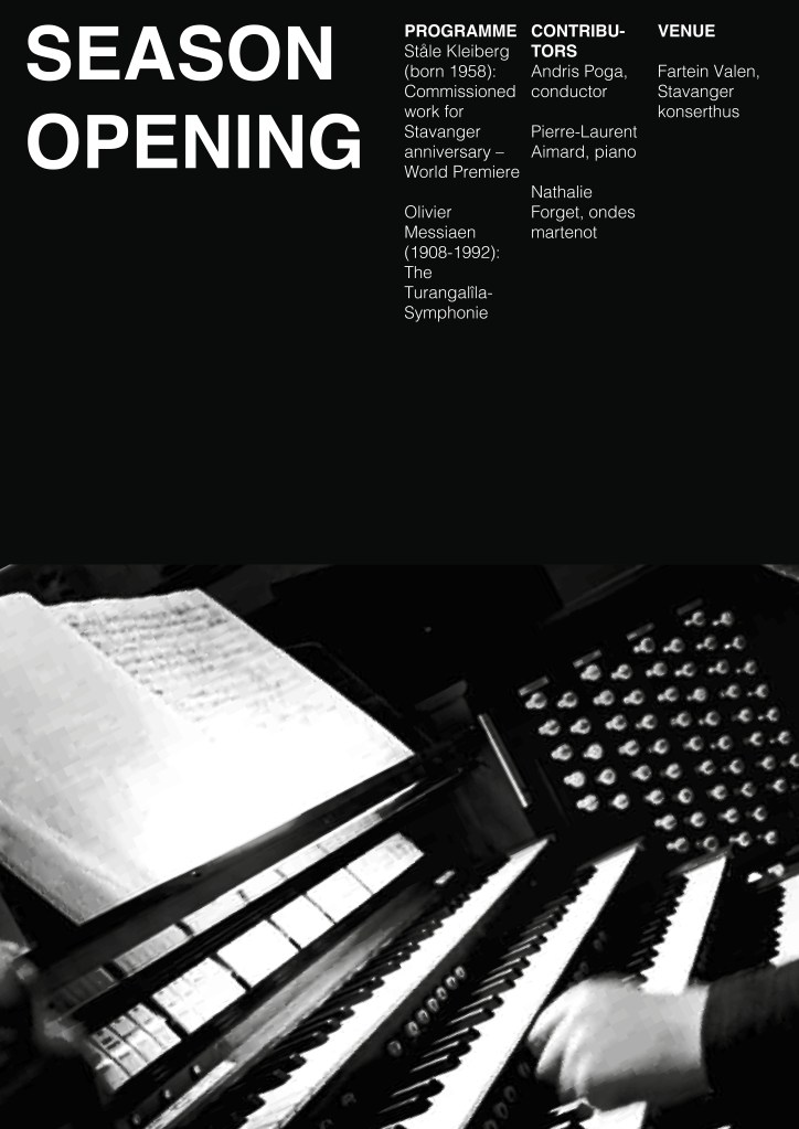
Lesson Task 1.4: Swiss Style Grid
My attempt at a simple but striking poster using the Swiss style grid – based on the work of Josef Müller-Brockmann. I would have tried to merge the photo and the background color a bit more if I had more time, but I liked it. Oh and worked out the “Contributors” part better, it looks weird chopped up. Had I had more information to put there it would have wound up as a text box horizontally.
I used This image of Olivier Messiaen on the piano for my poster image. It is from Store Norske Leksikon by George Tames/The New York Times/Scanpix. Limited use for the image but since this will only be used as homework on my blog I figured it could be used. If not then I will redo it. So, the image is not mine but George Tames/The New York Times/Scanpix´s.