5. November
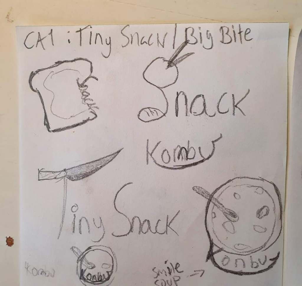
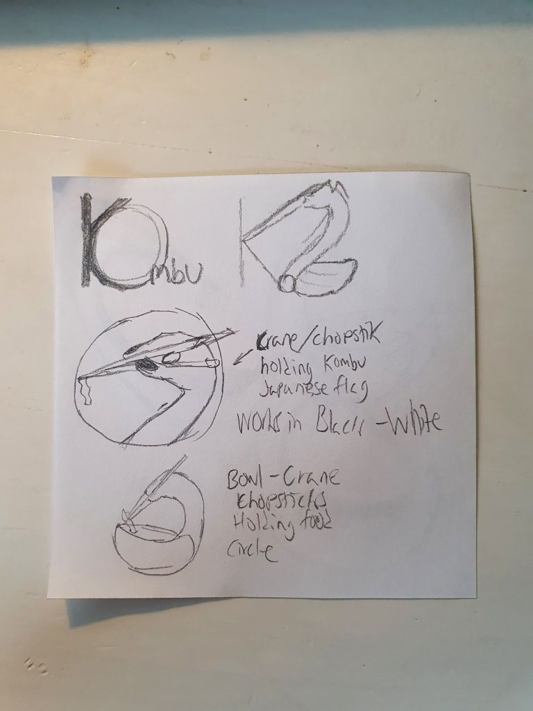
I have so far read the assignment and planned what the small restaurant will be named. Kombu, it means Kelp. It is edible kelp and is widely eaten in East Asia. So the small fictional restaurant has its dishes centered around this kelp. I have also begun to make sketches for the logo and I kind of know what color scheme I want. Though I have no idea what the text of the website will look like….. never mind I didn´t notice the assigned menus that I would need to take into account. Time to scrap 90% of my sketches.
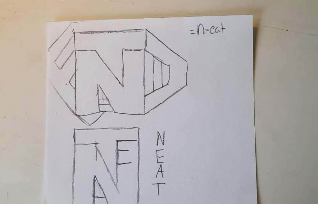
I chose the n-eat menu since it well sounded neat… haha smooth as sandpaper, and since my original plan was to have kelp-based food be a part of the menu, a plant-based one was the closest to my OG plan.
I have gone to Reddit forums though for inspiration. Like r/DesignPorn (it is just sweet designs, nothing NSFW) and r/LogoDesign. It really gave me inspiration but also let me know what is popular now and what to avoid. Giving feedback to feedback requests also helped me practice what I have learned over the first school year.
I already have sketches for the n-eat restaurant. It is a modern take.
6. November
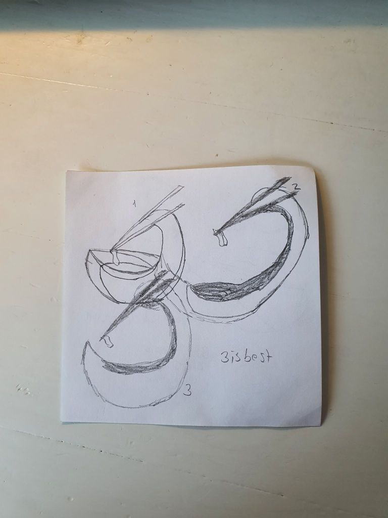
I have just watched a video on King Charles III royal cipher and I realized I could consider a proper Monogram for my logo. I still like my sketch for n-eat yesterday.
12. November
I have “finished” my prototype in Adobe XD, but I do not have the CSS skills to make it exactly like that. However, it does give me insight into the scale and how I like things sitting according to each other. I want things to stay within two columns (my favorite set-up) and to have only the necessary amount of images to not overwhelm the customer. Fewer images also mean less loading time, which is good since each second going to loading a website, is one second closer to the person closing the site before it has arrived.
I know it can´t look like the prototype in my HTML/CSS due to a lack of experience, however, I have an idea of how I want it to look like in CSS. Basically the same menu set-up but a removal of the buttons deciding the quantity, and moving the price to its own line in the dish description. In the prototype, the website doubles as an ordering site, which would be difficult with my new HTML/CSS knowledge. So, the design has to work either way. The most important feature is to have the reader understand what is served.
15. November


16. November
I so far have the HTML information done and have started with CSS. I am struggling to have my information in two columns and no source is giving me a straightforward answer. My right eye is twitching, time for a break. This can be finished tomorrow.
*5 minutes after writing that* “Okay never mind I am finding my answer whenever it will give me a stroke trying.”
I eventually found my answer on this cool website when trying to find the name of different fonts Dreamweaver can do. I can now rest and eat my dinner.
17. November
First snowfall gave me inspiration. I made a miscalculation. It is Thursday, not Wednesday. I hope time my design won´t be gray.
Yeah, I thought it was Wednesday and not Thursday so that extra day I set aside for making everything extra fancy got flushed down the toilet as I had to complete my HTML completely as well as 99% of my CSS. I want to slap myself on the forehead. At least my Menu is functional and easily readable. Now I just have to give more contact info on the contact page. Oh and make the home page less ugly before tomorrow. I can do this, I have faced worse odds and it is mostly just getting the things to look good in comparison to each other on the page.
18. November
Come with me, and you´ll see, a world of pure torture. Take a look and you´ll see, into a mess of CSS.
We will begin with heading. Traveling in the world of my HTML mess creation. What we will see will defy my old Expectation.
If you want to view my CSS. You can´t simply look and view it. Anything you want to see, you can´t. Want to change the code? Yes, yes I do. There is nothing to do now.
-my version of Pure Imagination by Gene Wilder
