*I have recently started having smaller paragraphs in my blog posts to make them easier to read on mobile. So if you have noticed a severe lack of thick paragraphs of me going on and on, it is because of that.
*I have also started on a sort of “log” for my milestones in the Course Assignment I have for HTML/CSS. It will be posted right before delivery so that my report can link to it. So, something will be posted on Friday before 16.00.
Activity:
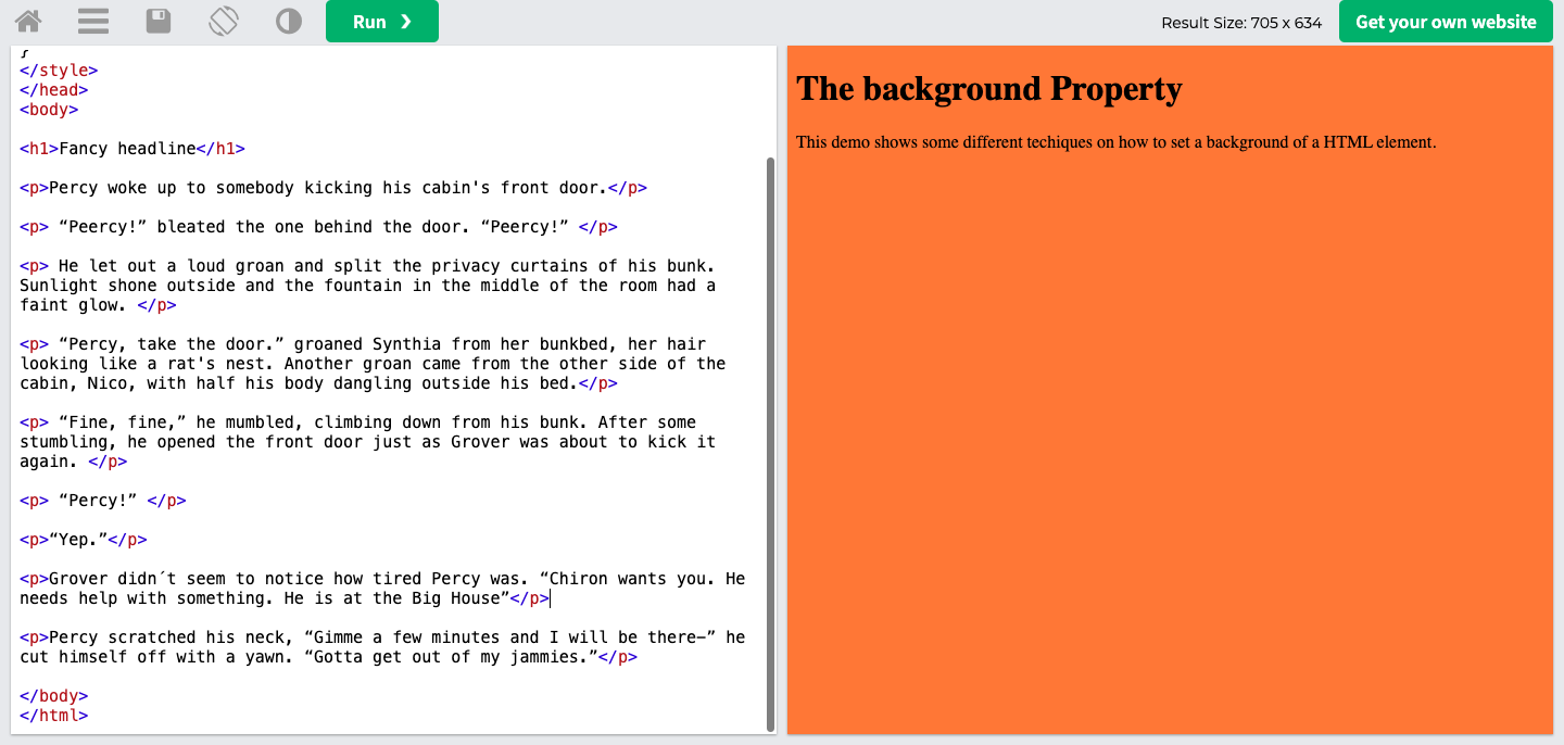
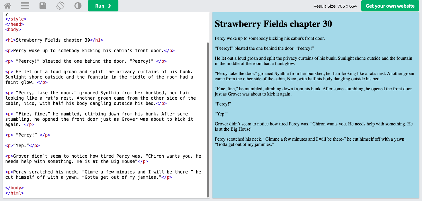
I played with the background on this website. I also put in some paragraphs from my fanfiction to show what it would look like.
I had not known that most of the background stuff was best done in CSS (I was not the sharpest knife in the kitchen last week, I know) and that it is CSS that helps change the look of the website on different-sized devices.
As I went through the information and videos explaining more thoroughly the differences between HTML and CSS, I realized that my previous attempts at a design were next to impossible. I used <div> when <span> was what was necessary to make it work. <div> is for blocks of content going down, <span> for things going sideways on the screen side by side.
I immediately began focusing on my upcoming Course Assignment since, in that project, some content would only work with <span>.
My main focus has been on the Course Assignment so that post will have more content than this one had.
 Yeisi Veronica