It has taken almost a whole year of studying Graphic Design for me to finally give my blog a logo. I have had the purple, white, and black color scheme since almost day 1, but the logo? Didn´t start it before the 5th of August when I was on the toilet and got inspiration.
My first idea was…decent, but it didn´t fit the theme of this blog, so after a few tries I got on the right track.
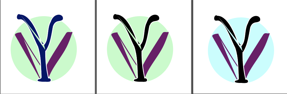
I decided on a circle because I like the symbolism it has in the Japanese flag (sun). I like the shape. It’s also a personal reference to how I struggle with drawing circles by hand. The circle also binds it together and gives a backdrop. Plus, I have been a scout in my teenage years and promised to try and protect nature, I still go by it, however, I came across the fact that everything in nature is its own form of a circle. Nothing is completely sharp edges. So, I wanted this in my logo.
It will probably evolve from here, but for now, I want something there.
