Guess who got sick? Yeah, that’s me. Luckily it wasn´t Covid again. I just coughed, sneezed, and slept for days. It got annoying to have droplets cover my screen so it was slow work. TMI? Anyways here is the result: enjoy
Task 1.1
Develop a name for a dog food product. Design a logo for this product, using full color. The logo must contain a main visual and typography.
- Exploration – Use sketching techniques to draw thumbnails and hand in your thumbnails as scanned PDFs.
- Focus – Highlight three of the thumbnail ideas that you consider the best options and state why. Hand in an A4 with visuals of the three chosen thumbnails; include reasons for choosing each of these three options.
- Construction – Use sketching techniques and redraw ONE of your chosen concepts until you’ve reached a conclusion on a successful logo. Hand in your drawings as scanned PDFs.
- Testing – Experiment more with your favorite options from Step 3 and ask the opinion of a few people. Hand in examples of the logos shown to people and write their feedback or opinion on each.
- Refinement – Choose your final design and execute it in Adobe Illustrator, along with the name of the product. Hand in your final logo as an A4 PDF
I have to say, I never had a creative workflow like the one I had to follow today. I usually just stroll around in real life, make some hurried sketches, and try and look after good pieces to put together or bad ones to remove. No thought about anything more than being able to see my point. Controlled Scatterbrain. This workflow felt more like a creative hindrance with all that PDF and A4 things to think about. I make sketches on post-it notes!
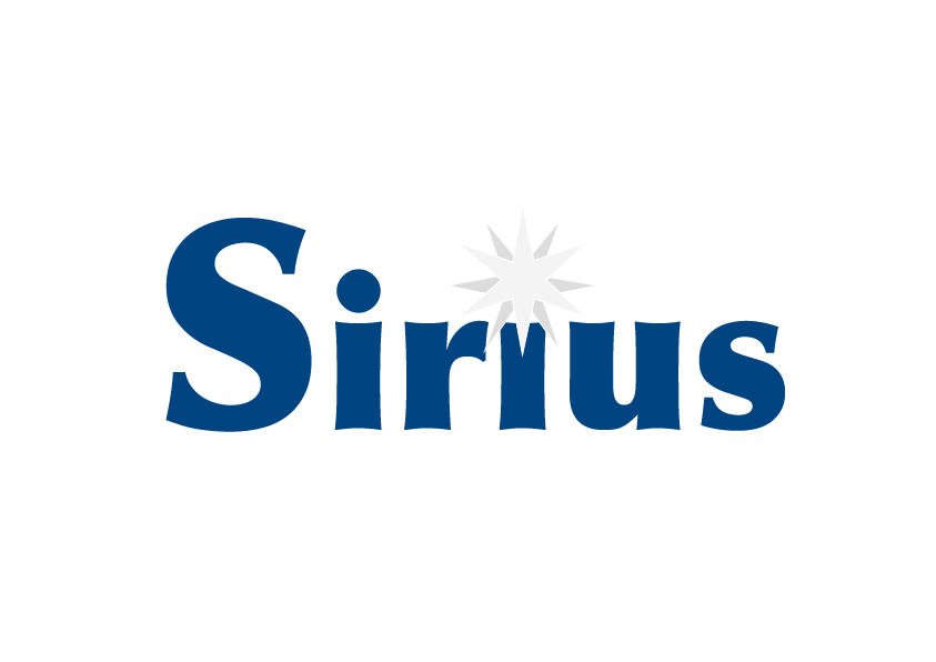
The dog food product I developed a name for was named Sirius Food. Why? Because the greek constellation Canis Major (The Great Dog) has its brightest star be named Sirius. And Sirius is called the Dog Star. Plus… I am a Harry Potter fan and one character that can turn into a dog is called Sirius Black. So I just had to. And the name Sirius Food almost sounds like Serious Food, so it sounds legit.
Color wise I knew I wanted a dark blue and white. Why? Dark blue for the night sky, and white for stars. And then I wanted a star to be present in the logo (and if not that, in my headcanon design of the rest of the product packaging or whatever). I then looked at the color wheel and decided maybe to try Tangerine or Papaya orange to contrast the dark blue idea.
I decided to just make everything into one PDF after this to just spare us all the energy to download things and load them in. I just added more artboards on Illustrator.
ATTENTION: I did not finish this in time, since I was supposed to do the last two steps on Sunday, but I slept through half of the day, and by the time I was going to ask people for their opinion, it was 23.04. So, I am finishing on Monday and asking my mother for feedback since I might have infected her with whatever is having me sick. So she will probably be available tomorrow on Monday. Other people, I know work and study too so they probably won’t have the time to give feedback.
Update Monday 13th: Mom wound up staying home and not going to work, so I got feedback. Yay?
So here is the logo in a PDF.
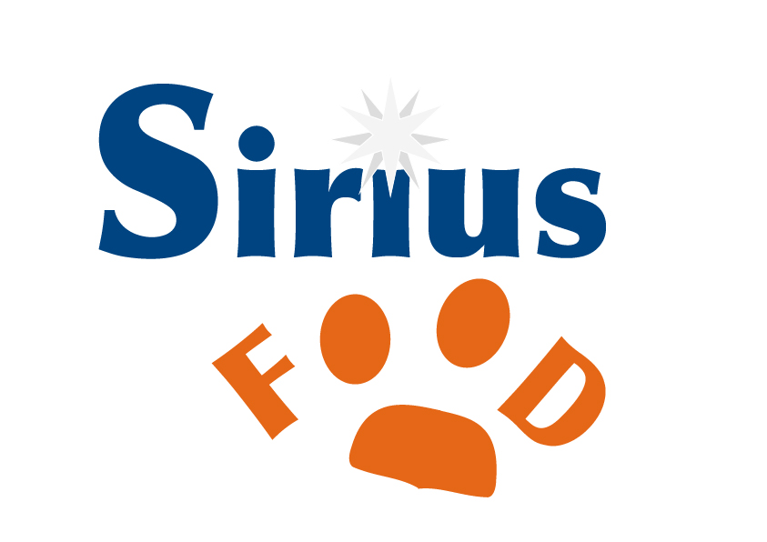
My paw-drawing skills with a mousepad on Illustrator is not good. as you can see on the bottom part of the paw. Yeah. But hey other than that little hook-part it is pretty good eh?
