8.1
Task: For this lesson task you must review three eCommerce websites, preferably small businesses (not in the category of Amazon or Walmart). Give star ratings out of five for the following categories:
- First impression
- Trust/credibility established
- Loading time
- Professionalism
- Creativity
Along with the star rating for each category, name three reasons for your rating and one suggestion on how to improve the rating.
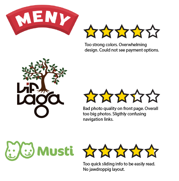
Meny.no First impression: 3 stars, Trust: 3 stars, Loading time: 5 stars, Professionalism: 4 stars, Creativity: 4 stars. (Total of 3,8 stars)
The colors were too strong and I didn´t notice that I could buy stuff from their website immediately. I could not see what type of payments they take and since I didn´t even know I could order things from there it took away some of their trust. They look professional but their creativity wasn´t a complete 5. A thing they could work on would to not overwhelm the people looking up their website.
LifLaga.no First impression: 2 stars, Trust: 4 stars, Loading time: 5 stars, Professionalism: 2 stars, Creativity: 3 stars (Total of 3,2 stars)
Pixelized picture on the front page that was way too big. Links that I did not understand immediately (like: Yggdrasil). It built trust by showing that it was doing good for teens but the fact that I could not immediately see what payment options there were in the Order page cut on the trust. The website was filled with articles that drowned and overwhelmed me, and I have already talked to some of their workers in real life and should know some of what they do. On the plus side the colors weren’t burning my eyes like Meny.no and the navigation links were in a good size and place.
Musti.no First impression: 4 stars, Trust: 5 stars, Loading time: 5 stars, Professionalism: 5 stars, Creativity: 4,5 stars. (Total of 4,7 stars)
The box with switching information goes a bit quickly and the where and how the information and products are displayed are not that creative. The website is however pretty, and eligible (despite the article body text being one size too small for my tastes). It shows trust by having the logo of Red Cross early on, as well as a way to find the closest store and way to contact them. Trust is also shown by having payment methods clear and separated on the bottom of the home page with more contact info and navigation.
8.2
Task: Choose two eCommerce websites from different retail fields. Create a diagram illustration of their category trees. Your diagram should clearly indicate the different levels of categories, as well as product attributes.
My two chosen websites were H&M and Mester Grønn. One sells textiles and some cosmetics, while the other sells flowers and gardening things.
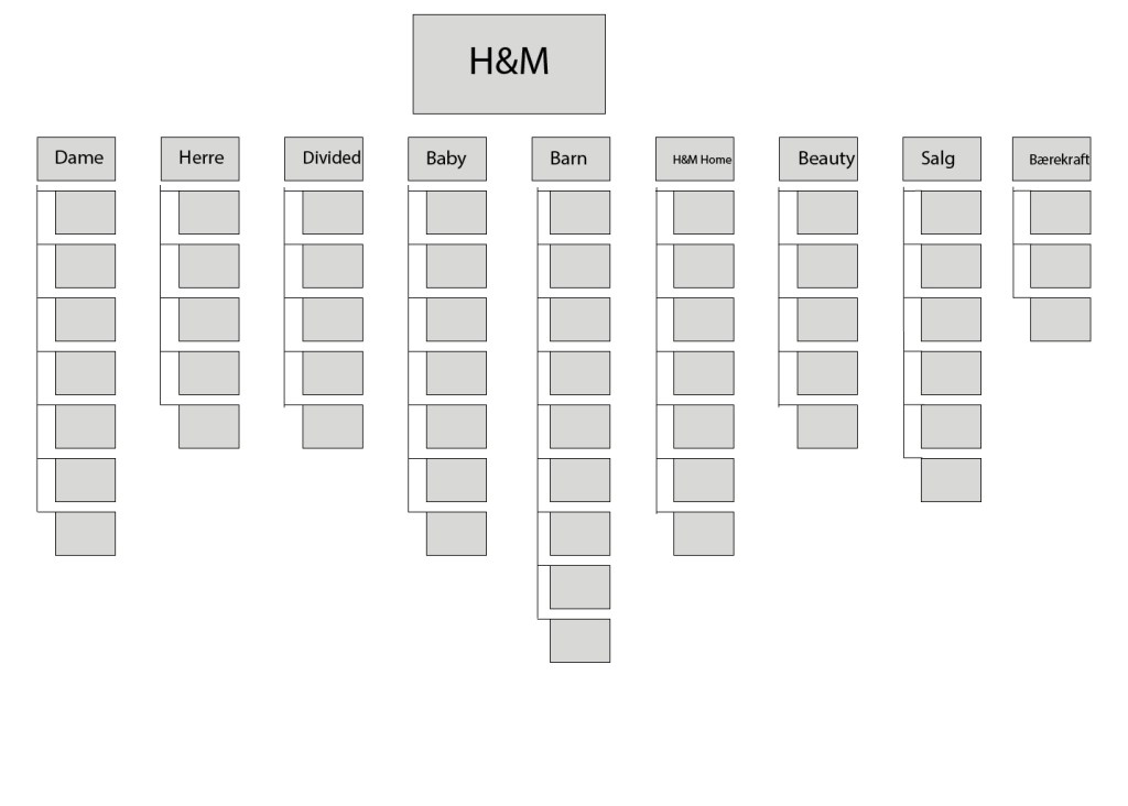
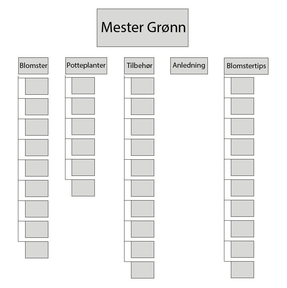
Since almost ever branch on the category tree lead somewhere I really simplified it. H&M would have been a nightmare to recreate. I do get the point of this task though, because it can be helpful to know where things are supposed to lead to, and if something is unnessecary to have its own category fro (cough H&M cough)
8.3
Task: Which are your favourite eCommerce sites that you use regularly? Pick one to focus on for this Lesson Task. Think about the functional design and discuss why each of the following pages are effective:
- Homepage
- Category page
- Product page
- Cart
- Checkout
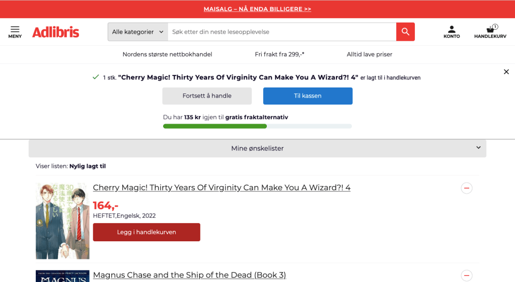
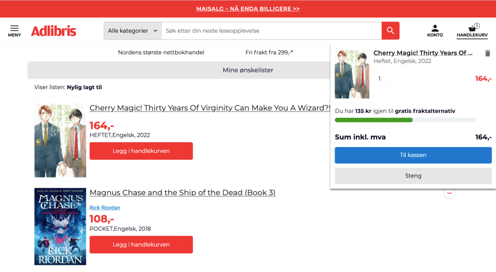
My favorite eCommerce website is the one for Adlibris, a book buying website. I love my books and I want to be able to order books in a simple way. While Adlibris can be a bit difficult when it comes to finding the right volume for my manga (especially a new series), it has such a simple and smooth checkout. Nothing ever distracts me from my quest to find volume 4 in the series, but the design on the website is still nice.

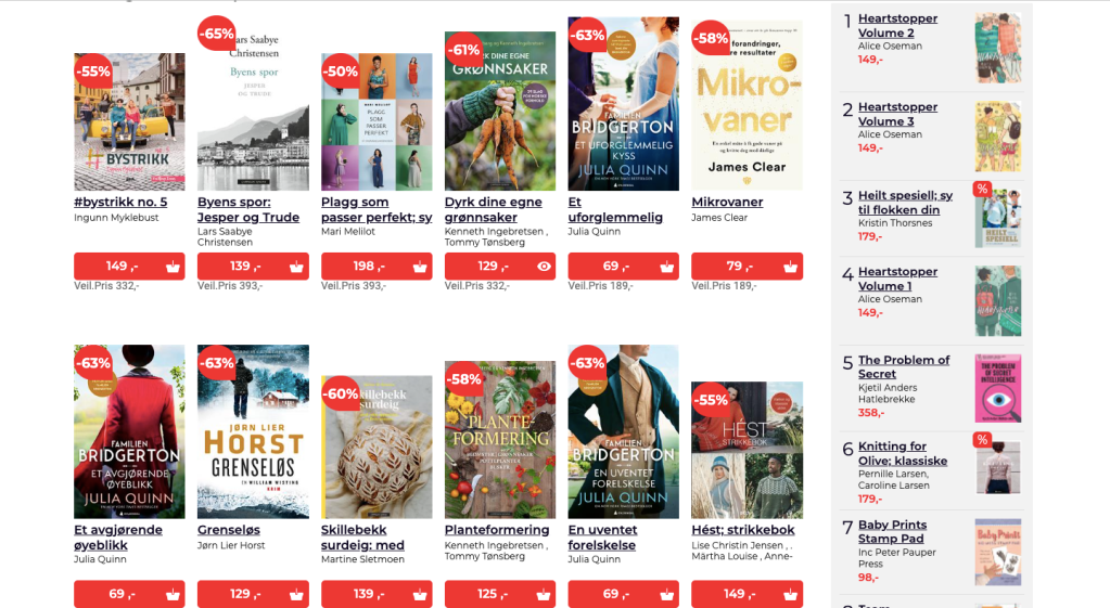
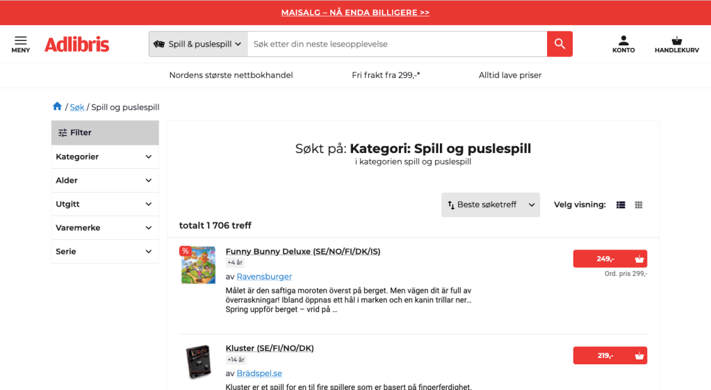

The homepage is organized but not that creative in how it functions and looks like. It is however, excellent at categories. Instead of there being a line at the top, you can click on the gray bubbles or filter the categories at the top next to the search bar.
The product page was nice and had good enough choices on how to view things. You could filter after things like “best hit” or by price. You could also decide if you wanted it as a long list (third picture in gallery above), or as a block setup (fourth picture in gallery above)
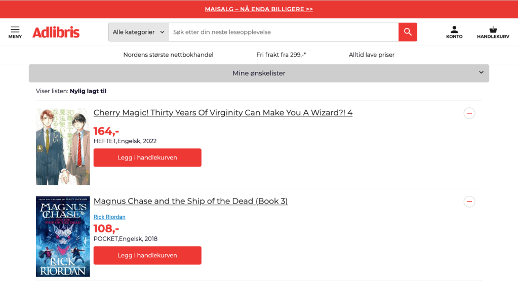
The cart page allows you to see how close you are to getting free shipping, and it also makes it easy to remove a product from the cart. It also displays the final price by the check-out button. Checkout is straight forward from what I remember, and is not confusing or pressuring the user with pop-ups and ads.
