Task 7.1
Task: Imagine you have been contacted by a local bakery called Crust & Crumb that opened in your neighborhood. They would like you to help them with their website design. Your task is to create a low-fidelity prototype to show them how the header and menu could look and work.
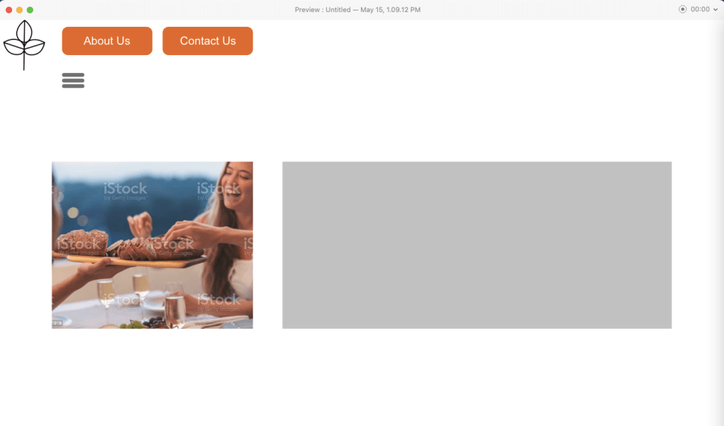


I have always liked hamburger menus since they are so practical. In the gallery above you saw the three states the front page can look like in low-fidelity. A hamburger menu you have to click on to activate. Then a hovering state over the different routes the website has. By clicking on the hamburger menu it is easier to not “slide off” and deactivate it. Thus, those with motorized disabilities can use it more easily.
This is the link to the design: HamburgerMenuBakery I forgot to add the function to go back though… heh.
Task 7.2
Task: For this task, you will be redesigning a form used to make appointments at a vet. Screenshot the website and then redesign the form section (both steps 1 and 2). Choose three components anywhere in the form that will show error states i.e., what happens if the user submits the form and there is a problem?


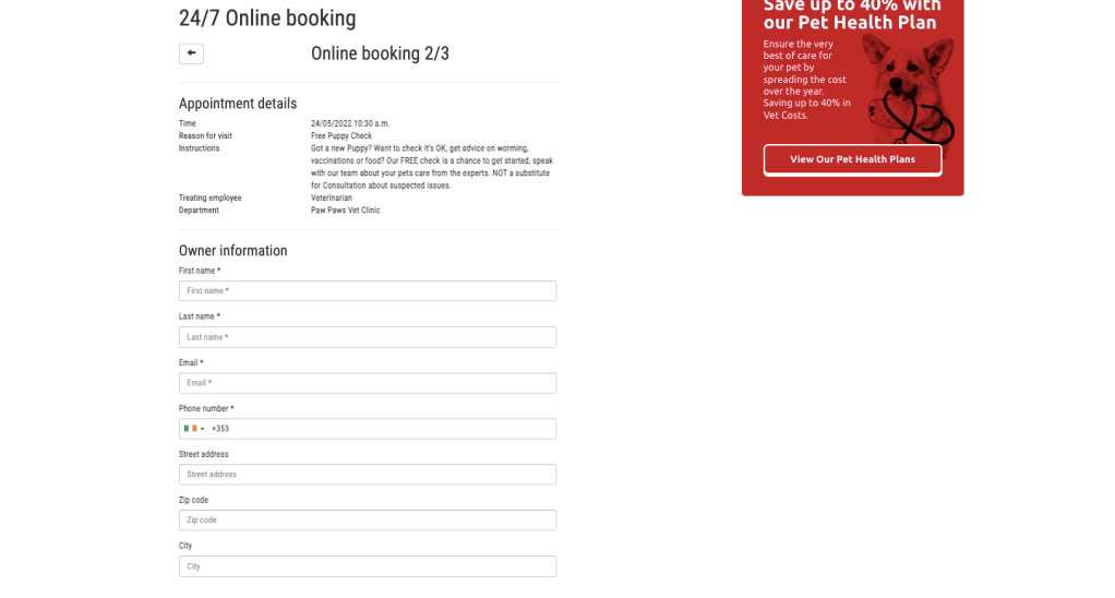

When it comes to errors I noticed really quickly that when choosing a breed for a canine species, the breed box spazzed out when just clicking it. I had to put in a letter first for it to show anything at all. It would have been best to just choose from a list, or from several categories. Speaking of categories, the website was a bit strange in booking an appointment. First, you chose a type of appointment with what type of service and animal you have, but then you have to specify if your dog is a canine on the second appointment step? Of course, my dog is a canine! What else would it be? A bovine?!
You know what, the order all of this is put in is wrong. First you should put in what type of animal you have, then what age it is, then its breed. Then its name and details. THEN personal info and appointment times. Dont spread the info. Dont allow someone to see the options Bovine and Reptile when they have already established that they want a Free Puppy Check.
When an error pops up in the new design, it should be red instead of flickering, and it will be as a red border around the box where wrong or insufficient information was placed. This will happen as the person is filling in, therefore they will not try and submit only for nothing to happen or an error page showing. The * that shows that something is mandatory to fill in, will also be red since it is an important detail.

Task 7.3
Task: Your task is to create a basic prototype to showcase the parallax effect using the prototyping software of your choice. The focus of this task is on applying the parallax effect, rather than perfecting the layout of the website.
This is the link for the flowy Parallex effect I did. Use the up and down arrow keys: Parallex Attempt 1

I tested a few things out, like having things slide up and down, or fade into another picture. I was a lot better at this than making menus. It was fun. Now I kind of know how it works.
