https://noroff.bravais.com/document/12719/preview
Ah, it was hard getting started with this. I have no idea how the internet or any of this works so dang is learning screen-based design hard. This is my second week of learning this, and I am not dead yet, though it feels like I am one step away from getting Thanos Snapped by just worrying. See, I worry, a lot, and if I have nothing to worry about, I worry because I am not worrying about something specific. This is entirely new and very worry-worthy, I then had a hard time starting since I can be a procrastinator, Like, just starting this post took me about 3 days, so yaaay.
On a different topic, I have noticed that the UI and the UX have been improved on some websites I use, like the health website for Norway where people contact their doctor etc. It might be because that the pandemic has brought people to the internet more. Now Helsenorge (the doctor website) has made it super easy to navigate and find info. So now I know firsthand how a different design really changes the experience. Instead of dreading to go to the website to renew prescriptions (like waiting a week to renew allergy meds prescription) I now am calm about it. I now sit in shock at how much the bad website design had affected me. (Example, previously I had to put in the exact details on the prescription I wanted to activate, now I could just choose from what my doctor had made available for me).
So now I am motivated to learn about good UI and UX just to save poor unfortunate souls from dreading to use important websites or websites that sell what they want.
Task 1
Have a look at this website. Analyze the product and think about it critically. What is problematic about it? How would you change it from a visual perspective (look and feel) to a human perspective (needs and wants)? Your changes might be as small as a color change or more extensive, like decreasing the number of animations present. Draw up a list and note your findings and solutions.
Everything is wrong. Change all the colors and stick to three main ones excluding black and white. Change:
- The colors, choose a few
- The font, don´t use the entire font list awailable
- Don´t use more than one animation in the view at a time, don´t want to get sued for triggering epelepsy
- The website is bigger than the screen… that is a sin
- Putting an ad in the middle of a page, not even intergrating it into the rest of the content on the page, should we one of the new commandments Moses should write
- Keep things in “boxes” just keep it tidy
- Just a quick spell check is all it takes to make this site better, its not that bad actually, the grammar too. It really depends on who they want to hit, if they want to reach the young the text can stay the way it is.
Task 2
Have a look at the design below:

Consider the following:
- Do you think it is accessible to users with eyesight trouble? Would they be able to read the text comfortably?
- What do you think of the labels of the main navigation? Do you think they are understandable and communicate clearly as to where they would lead a user?
- Do you think the contrast between the background and text colour is significant enough to be accessible?
Step 1
Do a straw test on the design by limiting your vision. Make your hand into a fist and look at your screen through the small space between your palms and fingers. Did you find it easy to read the information on the page?
I didn´t even need to peer through my fingers and palm, I just took off my glasses.
I could not interpret a whole lot of what was standing there. I couldn´t read what it said. Heck, I struggled to see even with my glasses on. I can understand what they were trying to do but the execution… eeeeh not all good. I had to squint with my face less than 3 cm away from the screen to read the bottom right text without my glasses.
Step 2
In your preferred design tool, recreate the website design. Pay close attention to the following:
- The text size of written content
- The colour usage and contrast. Text and elements should be easy to see and read.
- The labels should be understandable. The user should immediately know where they’ll lead them.
(You are welcome to change the look completely or stick to the current look and feel. Here is the Brand Style Guide and photograph).
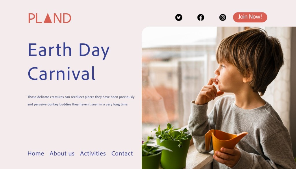
A little heavy on the right side with the picture but still, for a first attempt, I am satisfied.
Step 3
When you are done with your design, make your hand into a fist again and look through the small space between your palms and fingers to see if you can clearly read what’s on the page.
Since I designed this without my glasses 50% of the time… yes, it works. I could read better.
Task 3: A/n Coming Soon!
For this lesson task, take a look at this website. https://www.pennyjuice.com
Step 1
Go through the content on the website and conduct a content audit. List all the information and elements included in the website on a spreadsheet (like Google Sheets).
Step 2
Now, plan the information architecture using the card sorting technique. You can conduct a simple card sorting session using pieces of paper (with the help of friends or family), or you can use an online tool like Miro. When you’re done with the card sort, analyse your results.
Step 3
Finally, take what you have learned and redesign the homepage along with the website’s primary navigation. Use the design software of your choice to create a flat design; it doesn’t have to be interactive. If you would like, you can also draw a simple diagram of the main steps you think the user will take (the user flow).
