https://noroff.bravais.com/document/12678/preview
Posted on a Monday since I lost track of time 😛
Lesson 1: Question 1
Think about your personal experience as a web user and answer the following questions:
- If you search for a particular company and you cannot find a website for them, how does this shape your opinion of the company?
- If the website of a company or business is outdated, will it be a deciding factor of whether you will support the business?
- What elements on a website will help you trust a business or company?
- How do you feel when you come to an error page on a website? How does it influence your opinion of the company or entity to which the website belongs?
- If you struggle to find something on a website or don’t understand how to navigate where you want to be, will you try to contact them personally to find what you are looking for? Or will you close the window and browse to their competition?
- If you cannot find a physical address or contact details on a website, will this influence your overall opinion of the business or company?
- How long will you wait for a website to load before you give up and move on to the next one?
- If a website has broken image links or buttons that doesn’t work, will this influence the credibility of the company or business?
- When browsing the internet on your mobile phone, how do you feel about a website if the text is too small to read or the buttons are hard to click? Will you try to visit the website from your computer, or will you lose interest?
- Name one thing that will make you go back to a website and one thing that will cause you to close a website window?
I don´t usually go in on a lot of websites and I like different things about each of them, but these are my answers:
- If I can´t find a website on a company I am not exaclty angry or annoyed as long as I can find the information I need. Not everything needs a website. However, I can wonder how much time they put into reaching potential costumers. If they want to be reached at all. It makes me wonder if any questions I have are unwanted.
- It depends on how un-updated. If it is still within three years since the last update I can still see what they post as relevant and I can believe that they are still functioning. If it is severly outdated I don´t trust the company to still be active and do its job etc.
- Elements that makes me trust a buisness´s/company´s website is when their FAQ and contact info is easily awailable. If I can´t find their contact info on their own website how can I expect them to be organised?
- It just makes me annoyed that I can´t get to something I had planned to read or see. My vew on the company don´t change but I might not be that eager to use the website again.
- I never ask for help when it comes to website navigation unless I really need a specific information withing a deadline. Like when I struggled to find what I needed on the local library´s website. Closing tabs and walking out is a common thing for me.
- I does make me question if the buisness or company is legit. If I can´t contact them why would I make buisness with them? Why should I trust them? The only exception to this is if a friend had spoken for the website and confirmed it as safe and proper.
- I don´t wait more than 10 seconds unless I know the internet connection is bad and that thas why it takes time to load in. If I want an awnser to something I can have 0 patience unless it is a non-important thing like knowing the sunset time in Las Vegas.
- In my personal experience nun-functioning links etc doesn´t change my veiw on their credibility becuase things can “break” but it doesn´t exaclty lift my opinon on their buisness.
- I don´t mind zooming in to try and read, I have walked years with bad eyesight so it is not new to try and find a way to read something. So yeah, I do try to open the same website on my laptop if I can´t make it work on my phone. I can get mildly annoyed but I don´t lose interest becuase of a small thing like info not fitting into my small screen.
- One thing to make me go back to a website is if it is easy to navigate and with a look that fits the nature of the information there. One thing that makes me back out of a website is fonts that burn my eyes by being hard to read. Or if the website is a maze to find what I want to read. Or if it is infested with ads (specifically about hot MILFs in the area) and asks for Cookies.
Lesson 1: Question 2
Task: Take a screenshot of one website that you think is good, write down at least three elements that impressed you. Now take a screenshot of a website that frustrates you. Write down at least three things that are causing a negative experience.


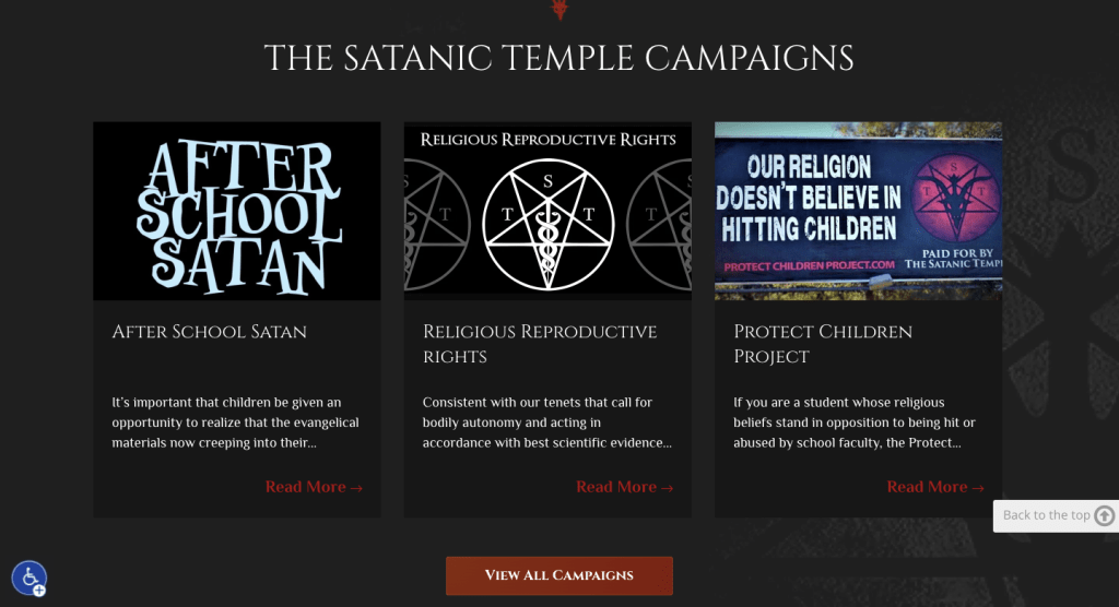
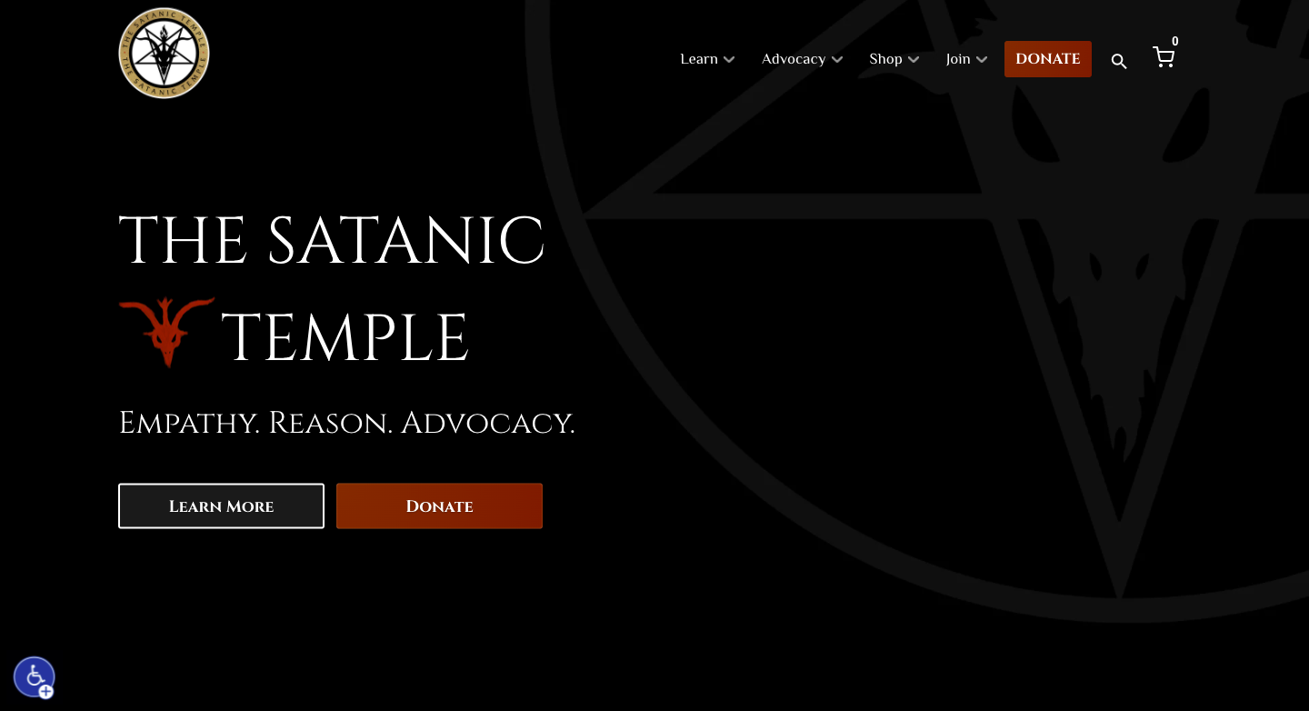
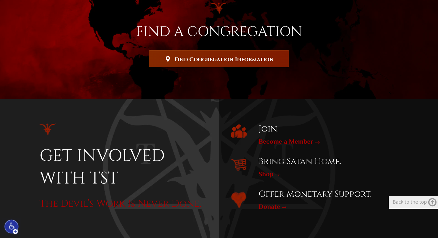
One of the websites I like is the website of The Satanic Temple (https://thesatanictemple.com/). It has a dark color scheme but I can still read what the text says. It has simple language and easy navigation, the colors fit together and it doesn´t feel like they are fighting for dominance on the screen. When you scroll it is flush and a nice transition. The font is something I also can read without much issue and the headlines are clearly separate from the body text.
This website makes me want to read more. It makes people want to continue even though they might not want to convert or find its style edgy.

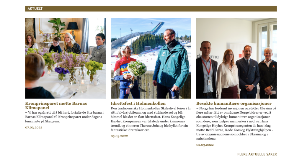

Now, this website frustrates me. The Norwegian royal family has its own official website (https://www.kongehuset.no/) and their website frustrates me. Why? The size of the text. Sure the website is pretty straight forward but the size of the text is way too small. The navigation panel is as small as the body text. For all that is holy and cursed they should have made it bigger! And the blue background on the articles… WHY? If the color scheme is white and gold then why do they have a light blue? Why not light orange or some other warm color? It doesn´t fit! And when I scroll through the page there is always leftover from the page before or after that slips in! The Satanic Temple made each page big enough so that it fits on the screen The website for the royal family didn´t! I scroll and it annoys me to see the next “page” at the bottom of my screen when looking at the articles they have.
I don´t want to continue being on that website for longer than I have to. I have only used this website for quick answers other websites didn´t have a sufficient answer for.
My mother asked me to write about another website than The Satanic Temple and to switch it to the website I am about to mention. My answer was: No. But I will go through it anyway.
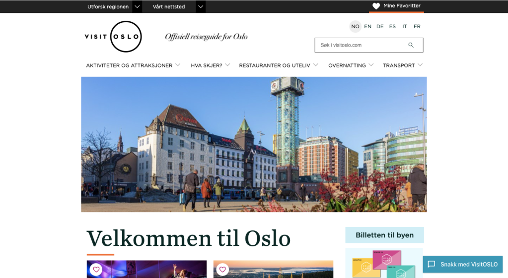
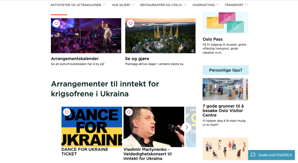

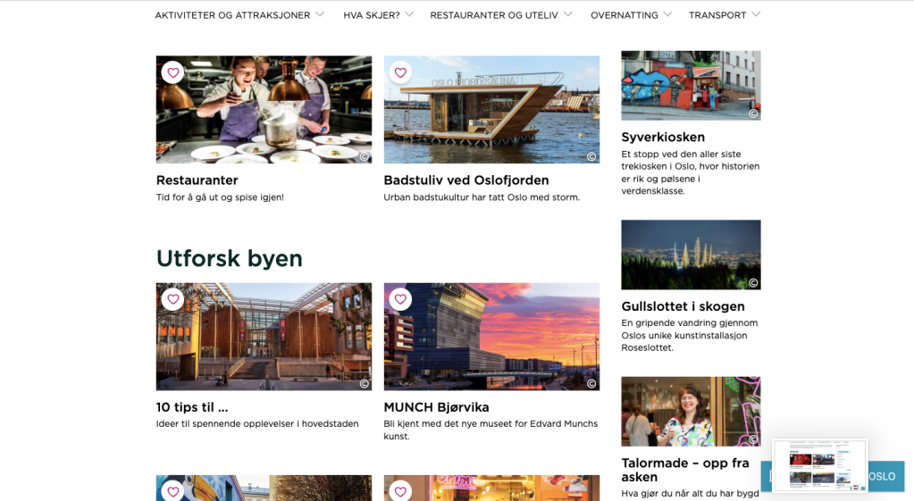
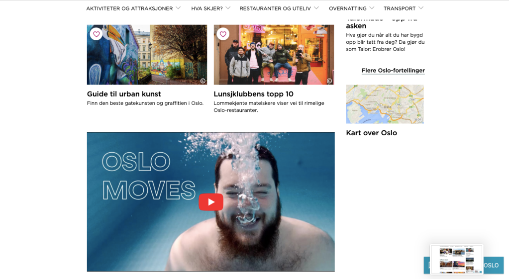
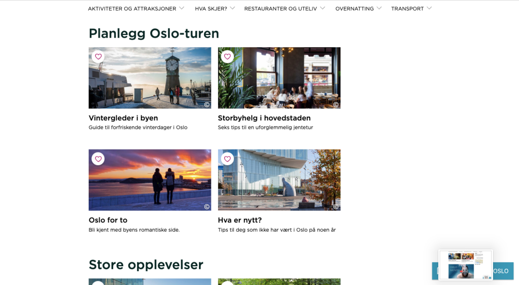
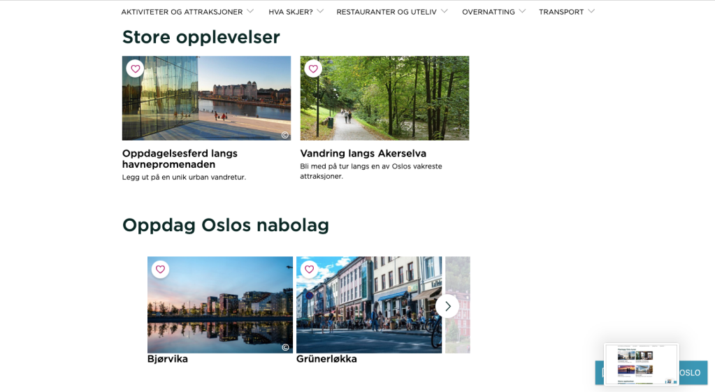
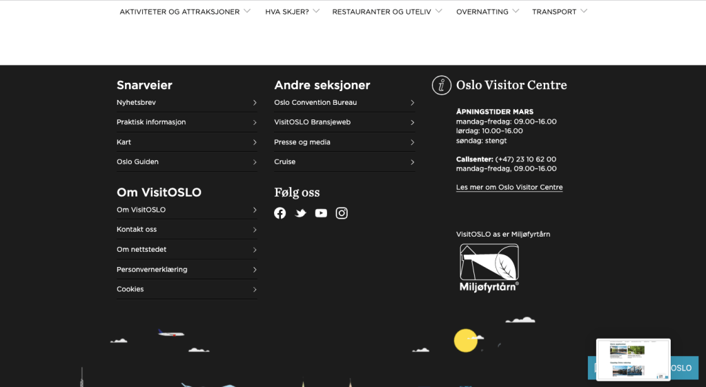
The tourist website for the city of Oslo has things I love and hate (https://www.visitoslo.com/) First things first, I hate that it has important information about the region OVER the logo and website motto with a black-stripe background that made it hard to notice. I don´t like that the motto was in a washed-out dark grey that looked blurry. I also didn´t like how the website works on mobile phones. It was hard to navigate there (some of the important info about the region was rather in its own menu in the top right corner where I had to SEARCH to find it because I knew it was supposed to be there). And finally, the logo and motto were a bit too small.
The good things are that the font used was eligible, the headlines were separable from the body text, the colors weren’t forced, the contact info was in a good place.
Lesson 2: Look at three different websites…again
- What do you think the main goal of the website is?
- What elements in the design are helping the users meet the website’s goals? (Look at the calls-to-action, navigation, and other design elements.)
- Who is the main target audience? Name at least five characteristics that define this group of people.
- How was the design used to attract this group of people? Discuss things like colour, font choices, photography or images, style and layout.
- How did you perceive this brand and its overall brand image? Was it serious and conservative or light-hearted and vibrant? Use your experience on the website plus any previous interactions you’ve had with the brand to motivate your answer.
Alright, the first type of website I looked at was a non-profit organization. https://www.rodekors.no/gi-blod/ It was a website about donating blood. I think the main goal of the website was to inform people about what blood donation is, who can do it, and how it is done. To do charity. The website´s design helps the user find that info by having large headlines in black and red with information in the headline being in semi-bold.
Their targeted audience are average to healthy people with a generous nature. The way the website tries to reach them is by having lots of pictures showing people (faces that the brain takes note of). It also has a design that makes it easy to navigate so that people who want to help can do it right then and there. Their wished demographic is very broad in age (anyone of age and not close to death) so their range of photos and topics is to attract different age groups. A photo of old and one young person, a rock concert, a photo of blood cells, a photo of a father with his child, a photo of many different hands by speech bubbles, an illustration of a pen as a needle in a man’s hand, another family photo. Those are vastly different from each other, so they try to reach as many as possible with a giving nature. They want to hold their attention.
I perceived the brand as legit and as something that cares for informing and helping people. It is light hearted and instills hope. I have been on a website very similar (also about blood donation) and that website was a nightmare due to the intense shock red background it had. This website worked a lot better to reach people with their message.
The second type of website I was going to look at was a retailer. I chose https://shop.change.com/nb-NO Change Lingerie to observe. I think this website´s main goal is to make money. What way was the website´s design done to reach that goal? Well, the first thing I see on the website is an ad for -25% off bras for those who are in the customer club. The ad is also very colorful and shows all types of women in Change bras.
Their targeted audience are women (or people with a need for a bra really but they haven’t made a sign to directly reach them) in age groups over the age of 18 to the age of about 50, that wants a bra made for them. People with money and breasts that need support. The design used was colorful and all info was like articles in “boxes” that were in a 3×3 grid. The headlines were not in your face and were more discreet while still noticeable.
I perceived the brand as organized and professional. It looked happy and easy to use (as supposed to some other websites where they did not have the same grid). I would trust the brand with finding me a bra, and not just because I know that they are professional at what they do.
The third type of website I was going to look at was a service provider. I chose the hobby photographer Mats Fjeldheim, https://mwfjeldheimmedia.wixsite.com/my-site-2?fbclid=IwAR1sr7DGG6r-WCeSbkhKeFFwoickqfLeTOC84g1BXdlQvr4qicNb3JBLBJg. I think the main goal of the website is to get commissions/work, experience, and money since it is a hobby photographers website.
The navigation is very easy and leads any user to the portfolios in two clicks. The navigation panel is at the top with a grey background to stand out from the otherwise black background. The navigation panel is not cluttered either and has only four categories, the categories a client wants to know.
Speaking of clients, who is this website trying to reach? Well, the ones that would look for a hobby-ist (or a freelancer) are most probably having a low budget, younger than 30, located within Norway (at best Scandinavia), creative, and working on their own business. So that is probably the target group.
The design is simple, clean, and modern. The colors are in greys and black-white. Sharp edges and a neat grid with a 2cm space between dark/toned down photos in the portfolio. This shows professionalism and tidiness. There is little disturbing the portfolio and contact info provided on the pages. Someone wishing for a freelancer will like the signs the website emits.
I perceived the brand as new and simple. The logo on the front page is pixilated so it is clear it is slightly amature-ish and that may be deterring. It fits the brand pretty well though since this is a rather new thing.
Lesson 4: Hierarcy
Task: Surf the web and find one good example of a website that uses hierarchy to guide the viewer’s eye on the homepage.
- Explain how visual hierarchy was achieved (scale, colour, spacing or contrast) and mention the viewers pattern if there is one.
- Take screenshots and to put together the website’s colour palette. Describe the use of colour in terms of primary, secondary, and accent colours.
- Use screenshots to show and discuss the different text styles and choice of fonts for these (mention at least the H1, button and body text styles).
I am going to be simple here and just use The Satanic Temple´s website for this task since I already have screenshots of the website homepage.


- Ny start på Kristiania
- Motion Design Lesson Tasks and Modules
- Lesson Tasks: Motion Design – Module 2
- Lesson Tasks: The history of motion design
- Lesson Tasks: PREPARING YOU FOR THE WORKPLACE
2022 2023 2025 April August Blogg Brochure coding Course Assignment CSS December DigitalArt February Graphic Design History html January June Kristiania Lesson Tasks Logo March May Module Assignment Motion Design Norsk November October Personal Photography Pre-Noroff Report School Work Screen Design Semester Project Strategic Design The Vegan Van Typography
