https://noroff.bravais.com/document/12298/preview
I have put the instructions I got for this task underneath. This week I learned about printing prep. My first attempt at spot varnish etc.
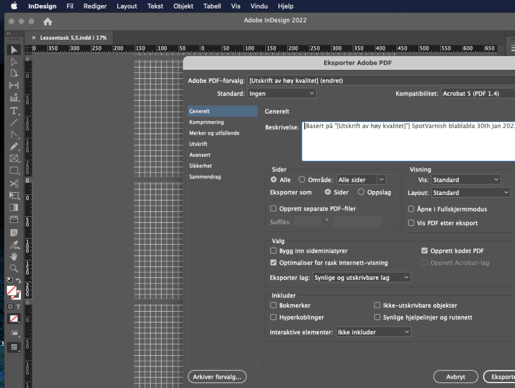
INSTRUCTIONS GIVEN: Design your own printing checklist form. Make sure to include the instructions (like spot varnish, paper choice, and binding) in the file.
- Use the magazine-style brochure that you designed in Module 5. Add a spot varnish to the cover and change the design to use a spot colour (you are welcome to make layout changes if you want to).
- Make use of your checklist that you designed and prepare the file for print.
- Decide what paper weight and type you will use.
- Decide what type of binding you will use, for example, saddle stitch, perfect bind, etc. Do some research about the options available and elaborate on why you chose this method.
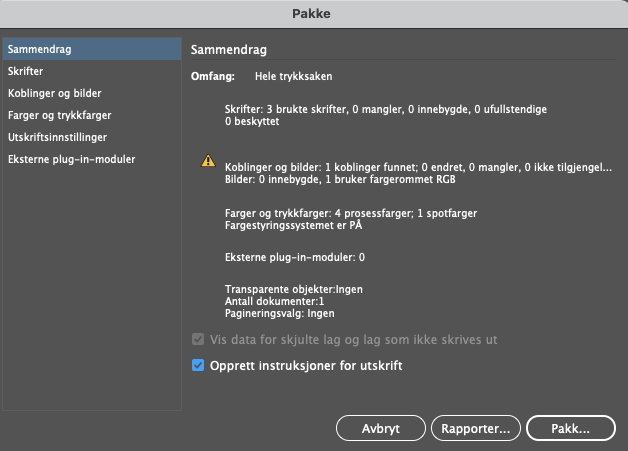
I have no idea about paper weight and such but what I do know is that the design that is shown further down would be best in a light paper. You know those cheap brochure papers that are easy to bend. The shiny thin ones.
Why do I want it bend-and-fold-able? Well since I want it all to be one long slip of paper. I want it to be folded into the correct pages. Page 4 and 5 will then when it is all folded out, look like one broad page. No stitches, only folding. I love folding.
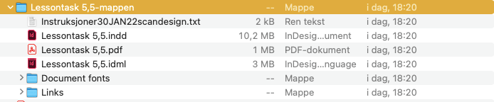
So, when you see the PDF file and see the pages, imagine it as one long strip of paper that will be folded to have a front and back. This will save money from cutting each individual page up and stitching them together. It will be similar to a flyer but this is in a bigger size so it is a brochure.

Lesson Learned
- Rich black for big expanses with very black
- Standard black is for things like text, in big size it looks grey
- “It is very important to note that rich black should never be used for any newspaper artwork. The reason is that a newspaper’s paper is very thin (It is called “newsprint”) and absorbs and spreads ink quicker than any other printing paper. So, in the case of newspapers, standard black looks like rich black.” -Noroff
- The errors at the bottom of the page actually matter.
InDesign pre-PDF checklist:
- Document size
- Bleed size (3mm, 5mm etc.)
- Artwork is extending into bleed sufficiently
- Type area (live area) – Especially relevant for magazines
- Colour swatches (CMYK or Spot/Pantone) in colour list are correct and unused colours have been deleted
- Rich black and standard black have been used correctly for the appropriate elements
- Images are CMYK
- “Effective dpi” has been checked on all images (needs to be 200-300dpi, preferably 300dpi) – check this with your printer. Note that when checking dpi, it will show you “effective” and “actual”. You need to check the “effective dpi” (see below). For example, if a 300 dpi image is scaled up 200%, the effective dpi will be a lot less than 300dpi.

- Spell check – It is good to run an automated spell check as a precaution to see if anything unusual pops up that someone may have missed in the checking process.
- “No Errors”: There is a feature in the footer of InDesign that picks up any issues with the doc like missing fonts, images or overset text. This light must be green.
- Finally, all type should be converted to paths/outlines. There is a range of ways to do this. There are ways you can set up a preset that converts the text only in the PDF and not on the working document (this is useful for docs with lots of text, like brochures) and then there is the manual way of selecting text and converting it. If you use the manual way, make sure you duplicate the text onto another layer in the layers palette to avoid losing the original text version. One of the worst things you can do is convert text to paths and then save the doc, close it, and open it up again to find you don’t have the editable text anymore. Imagine recreating a massive brochure or annual report because you no longer have the original text version!
