https://noroff.bravais.com/document/11848/preview
I have seen the number of tasks/assignments I need to get done, as well as the old tasks I never finished. I feel my soul drain from my body.
On another note, I had issues with InDesign this Sunday and thus everything got halted. I started on the tasks at 22.00 on Sunday so yeah. Don´t fear though they are being worked on right now, I just have to rush them so that they don´t pile up with my Semester Project, and everything else. BEHOLD THE GLORY OF MY RUSHED TASKS.
5.1
- Rearrange shapes cut out of paper and find the point at which the figure disappears into the ground.
- Cut out a series of shapes from black paper – squares, rectangles, circles and random shapes – in various sizes, from small to large.
- Working with a square piece of white paper, place shapes of different sizes into the white space; place them on the white one at a time and move them around.
- Try to find the point where the distinction between figure and ground becomes unclear. Does it depend on which shape dominates the space: black or white? Is it about the position of the shape within the space? Think about how important figure-ground relationships are within composition and design.
I remember doing this in Design and Redesign during junior high and in Arts and Crafts. We used a hole puncher on colored paper and fabrics and then spread it out over a large white paper sheet. A thing I noticed is that the more there is of a white background the more it turns into a foreground. However, if there is one black dot in a right corner, then it is the black dot in the focus and in the foregorund depsite the white being larger.
5.3
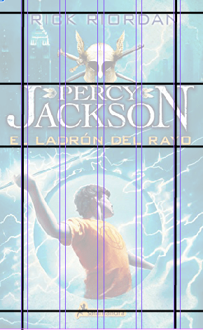
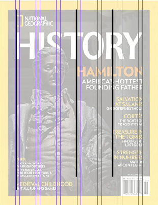
- Take a magazine, and a newspaper and a book that includes images and text. Lay tracing paper on top of three different spreads (both left-hand and right-hand pages). Use a pencil and ruler to trace the grid underlying the page layouts carefully. Remember to remove specific text elements or images and only to draw the grid lines. Note column widths and margin sizes at the top, bottom, and left and right of the main body of text. Is your document based on a two-column, three-column, or another type of grid? Which elements stay the same on each page, and which change?
Since I don´t own newspapers or magazines I decided to do this digitally. I chose pictures of things I have either read before or is popualr or something I am familiar with.

5.4
Compare the design (in terms of pace and contrast) of an online magazine, blog, or website to that of a printed magazine, book, or journal.
- What differences can you see between the kinds of design strategies used in the two formats?
From what I can see the differences are that the web has fewer restrictions. At least with blogs. They can have more of a flow between the pages so that it is just one large page. Printed magasines must think about actual pages. Book covers are basically the same though. I checked. They are pretty much the same in layout.
5.5
Use InDesign to design an 8-page brochure for a fictitious décor shop.
- The size of the brochure should be A5 (when it is folded).
- Design the brochure in full colour.
- You are allowed to use Lorem Ipsum place holder text as body copy, but create sensible headings.
- Use titles, headings and images of your choice.
- Be sure to pay attention to:
- Choice of type
- Choice of imagery
- Use of layout and grid to communicate the content
Guess who´s InDesign is being stubborn and wont let the user do anything? Thats right. Me. And on a Sunday evening as well, the one day I got time to do stuff. Luckily I fixed it within an hour or so.
As you can see I have named this fictional decor shop Scandesign. Specializing in scandinavian design. I chose a light icy blue that reminded me of the north and then used the analog colors that Adobe Color provided to the icy blue hexcode. For the images I said “What better way to find things than IKEA?”.

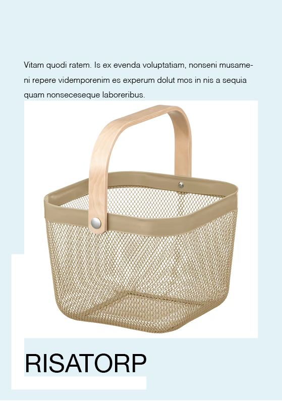
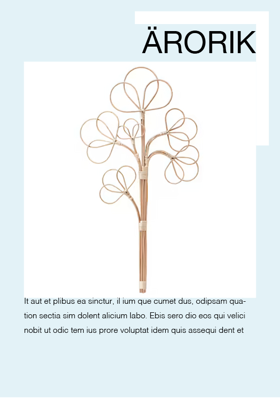


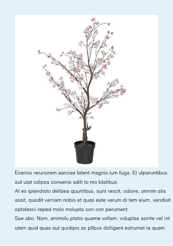

As you can see, the titles on the pages are in swedish, since I am half swedish and decided that it looked good. I used the product and category names on the ithems from IKEA to use as headings. The font is easy to read and I used few shapes for once. Look, I am learning!
