https://noroff.bravais.com/document/10437/preview
Hello, this week I was learning about color theory. My tasks here might be pretty bad since my stubborn butt decided that being sick and doing school work was a fantastic idea. I am proud of my Hunger Games book cover though. And as you might have noticed, I write “Color” not “Colour” because I am used (and better at) writing in American English. No extra U´s our RE instead of ER.
Question 1:
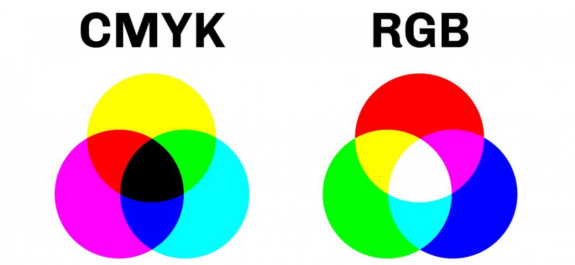
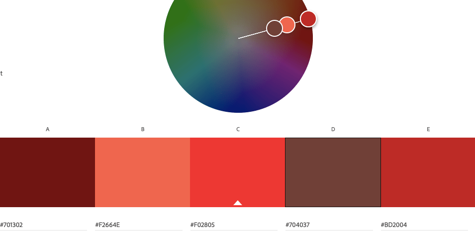
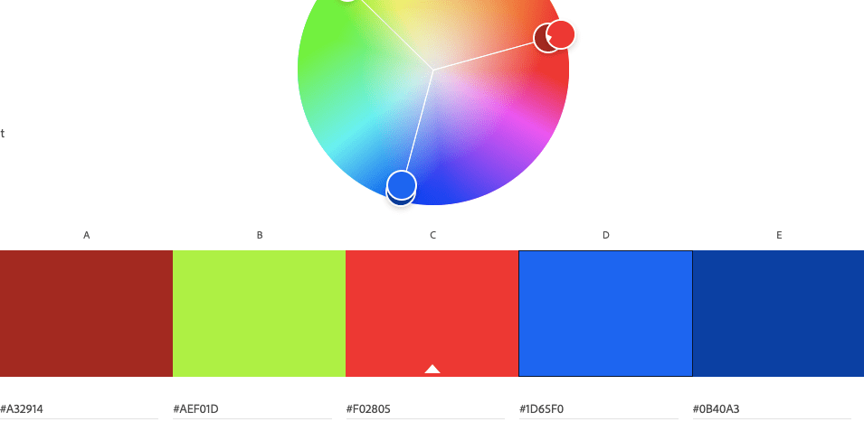
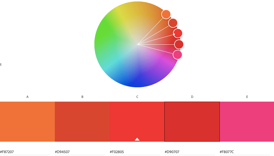
Having watched the video of Nigel French – describe, in your own words, what each of these color systems means: RGB and CMYK. Add visuals to show the difference. Make use of Adobe Colour and develop four different color schemes. Please hand in screenshots of your schemes: Monochromatic, Complementary, Tetrad, Analogous.
Have you ever tried to print something out and the printer is like “Haha fuck you, I am out of cyan!” and you can’t do anything but give the printer cyan even if it seems like the paper you want to print is black-and-white? Well, the printer works on the CMYK system; Cyan, Magenta, Yellow, and Key. Key is a fancy word for black here.
When you make digital art of any sort you can choose between doing it in RGB, (Red, Green, and Blue) or in CMYK. When I was studying Media and Communication in high school it got drilled into my head that CMYK is what you use for when you print something out. Why? Because the colors might get wrong if you have used RGB on the document.

Question 2:
Use a color photo of your choice and create the following color effects, using Photoshop. You should hand in four separate works of the same photo with the following effects:
- Create a fluorescent duotone using a Gradient Map adjustment layer.
- Apply a monochrome look (choose a different colour than black/greyscale).
- Split toning of the image (note that the tool in Photoshop for ‘Split Toning’ was changed to ‘Color Gradient’).
- Freestyle: Create a colour effect of your choice
This will be added on Monday, it is not done yet. I don´t want to do this at 22.31 on Sunday night.
Question 3:
Design a book cover for one of the titles below. You need to choose one of the color schemes and explain why you chose this scheme. For instance: ‘The Secret Garden´ by Frances Hodgson Burnett could be created using secondary colors to express naivety, honesty, and harmony.
- ‘Lord of the flies’ by William Golding.
- ‘The Hunger Games’ by Suzanne Collins.
- ‘Charlie and the Chocolate Factory’ by Roald Dahl.
The book cover must contain the title and the author’s name. You must make use of color to express the desired effects clearly.
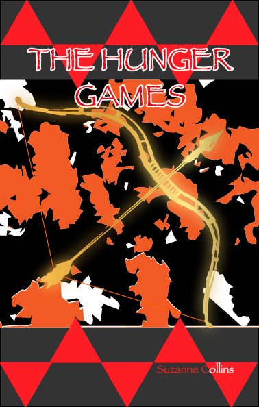
The colors I wanted to go for were firey reds, oranges, and yellows. Some black and grey to simulate ash was another thing I was planning. I wound up with some sort of modern look. The forest picture (viewed from above) got very simplified and the bow got turned into gold. I also made sure it was glowing. It was a strange but interesting look.
What I have learned:
- That trying to be creative while slightly sick can produce fun results, but this week only dumb ones I couldn’t use.
- That I should not have put this off until the end of the week because you never know when you get sick and/or need to do other important things.
- That warping or simplifying normal picutres can produce amazing visuals that can give you new exiting inspiration.
- That if my Clipping Mask wont work it is probably beucase the figure I want to get fused with the back is not placed “in the front”. The object might need to be manually placed forward.
- That masking a figure with metal and then making it glow gives it a holy look. (When you have used Clipping Mask and made the object metal you copy the figure to a new layer. The bottom layer is then made glowing using Gaussian Blur).
- (More like reminded) that if you are about to place an image into Illustrator you can directly edit the image in Photoshop. If you edit it in photoshop (with an image saved on your computer) you can just save it and go back to Illustrator and allow it to synch. Then you dont need to go the extra mile to save and then place again.
- Illustrator is for… illustrations. You can draw with a different program made for digital drawing specifically (like Krita) and just place that image into for example InDesign. It is just about taste.
- Oh and weekly reminder to myself to USE THE MOODLE FORUM.
