What is typography? Well in simple terms it is how your text looks and why. Good typography fits perfectly into the role it is supposed to have in that situation, bad typography fits as well as a polar bear in a tanning salon. It can be difficult to understand. One of the most important things with typography is that it has to be readable, otherwise, what’s the point? Unless the point is to mimic how those with bad eyesight read things. Or that is supposed to be some sort of art and the point isn’t to be super readable.
https://noroff.bravais.com/document/10417/preview
3.1 Expressing meaning
PART 1: Choose three words from the list: Eat, Landing, Slippery, Gnawing, Slide, Frozen, Cram, Charisma, Hurry, Hoist, Construct, Study. Create three different typographic compositions, showcasing your three words, one word per composition. In each composition, arrange each word to express its meaning, using only black and white. Consider all and any means at your disposal: dramatic scale contrasts, cutting, repetition, letter spacing, etc.
My chosen words are Slide, Cram, and Charisma.
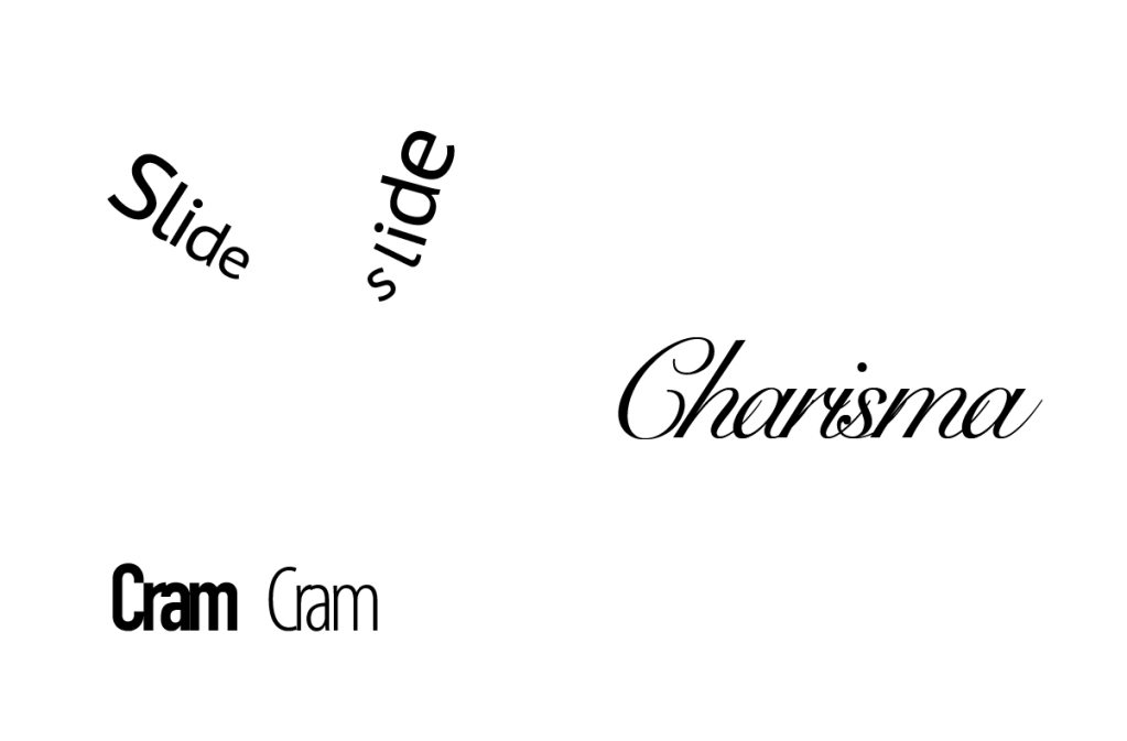
Slide was written in PT Sans Caption (Regular), I chose this because the most important part of the word was its meaning. It was sliding, and thus I wanted the word to look clean, so no serifs. I also made sure to make it look like the word was indeed sliding, so I wrote on a line made with the Curvature tool. How I did that was using the Type on path tool.
Cram was written in DIN Condensed Bold (Bold) and then also in Myriad Variable Concept (Light Condensed). I chose a sans-serif font since serifs would look out of place, the word isn’t meant to be fancy. It means being pressed together and that is why I chose a font that was filtered as “Heavy Weight” and “Condensed Width” in the character font filter system. Cram number two has lightweight properties and a condensed width. It also has a high x-hight and low contrast.
I wrote Charisma with high contrast calligraphic. Why? Well, it felt… charismatic. It felt “sexy” it is the sexy font.
PART 2: Create a new word, one which has no dictionary definition and meaning that you made up. Then follow the same process as question 1 and create a composition using typography, to showcase and express the meaning of your word.
My word is a word describing “beautiful glittering snow”, Glintø. Taken from the Norwegian words Glitter and Snø (snow). Since it is a new word I decided to change certain aspects of it to make it a truly new word and not just a knockoff mess. A new word is often affected by the connotation the word maker has to what the word stands for, so if it is a bad thing its name will signalize that. Beautiful glittering snow has to sound a little elegant, but still fit into the language it is supposed to be used in. Norwegian doesn’t always have words that reflect how nice something is. Snø doesn’t sound cold or directly beautiful, for example. Glintø is supposed to fit into the Norwegian language so I tried to make it fit in by basing it off Norwegian words and such. J. R. R Tolkien created his own language, Quenya, and it is similar to Finnish, Greek, and Latin. It is an elven language and seems just as elegant as its native speakers. The words fit the culture.
Gli is from Glitter and the Ø is from Snø, however, the NT isn’t directly from either of these words, sure there is two T´s in Glitter, but there is no letter between the I and the T. There is in the word Glintø. The N is very strong. The word is pronounced: Gl-ee-NN-tø. The N is important, but not harch, the word is an elegant word since it describes “beautiful glittering snow”. Therefore a cursive will probably portray the word and its meaning well, much better than a blocky font.

I remember doing this in High School but I think some things had changed or been tweaked. I had planned to film how I did some of these tasks but when the programs didn’t want to cooperate I decided it would just be too much work a Sunday evening.
In order to make this type of effect with the text I took an image, placed it in Illustrator, then put the appropriate text over (same layer). After that I selected both with the Direct Selection tool and went into “Object” and “Clipping Mask”. A shortcut is “Cmd + 7”. There is a different method if you do it in InDesign. Here is a video on how it was done in Illustrator https://www.youtube.com/watch?v=2tmYhahfLVI she talks for a while but it is the most accurate video I could find.
3.2 The anatomy of type (Not Finished)
This task involves working with typography in layout. For this task, you’ll need to explain the anatomy of type visually, using the entire alphabet (upper and lower-case). Using color, show each of the following on the alphabet: Arm/leg, Ascender, Bar, Bowl, Cap Height, Counter, Descender, Ear, Link, Loop, Serif, Shoulder, Spine, Spur, Stem, Stress, Stroke, Swash, Tail, Terminal, X-height. You may use a single typeface or different typefaces for the execution. You can experiment with the design as long as the visual message is clearly expressed to the viewer. The format should be 210 x 210 mm square.
https://noroff.bravais.com/document/10417/preview
3.3 Designing a film festival poster
This task involves working with typography in expressive layout. Design a poster for a film festival. You can decide on the name and remember to include the date and the venue. Focus on strong and expressive typography. You are allowed to add visuals. Use an A3 format at 297 x 420mm. Expand your design to include a pamphlet that outlines dates and further details of the festival. Remember this design must be consistent with your poster design. The pamphlet can be any size or format. Have a look online for inspiration.
I chose to make a poster for a Western-themed film festival. You know, cowboys and stuff. I decided to use InDesign despite having an old love-hate relationship with the program.
The front side 
The first page 
The second page 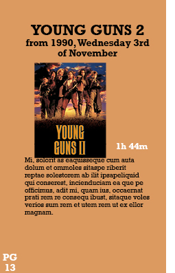
The third page 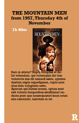
The fourth page 
The back side
I chose the movies within the genre of “Western Action-Adventure” and these movies were some of the ones to show up in the Google search results. I chose the ones with a similar color scheme and look.
