A new week, a new set of lesson tasks.
Word count: 2002
1.1 Lateral Thinking
My first task on the 25th of October 2021 was Lateral thinking. I remember the work from when I was reading my graphic design book on the subway.
Lateral thinking: A form of research where the empathis is on indirect, creative forms of inquiry and thinking
Graphic Design School seventh edition by David Dabner, Sandra Stewart and Abbie Vickress, page 14
Creativity is to solve a problem or challenge with ideas that others might not have thought of, at least not as their first thought. It can be difficult and rage-inducing to try and find a creative idea in your nogging, especially when you see others have in your eyes exceeded anything you ever come up with. That is the thing though, just because you don’t find your ideas creative doesn’t mean that they can´t be to someone else. That it can´t be good. Plus, your initial idea might not be even noticed should someone look at a product you have made because their own creative thinking can take it completely differently.
For task 1.1 I had to try and guess what each of the pictures was trying to tell me. Trying to convey. I wondered how much I have to look into each picture but I did have some thoughts about each of them.
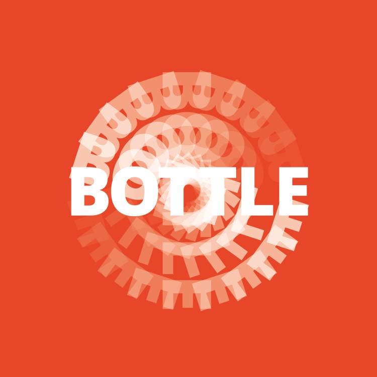
Bottle 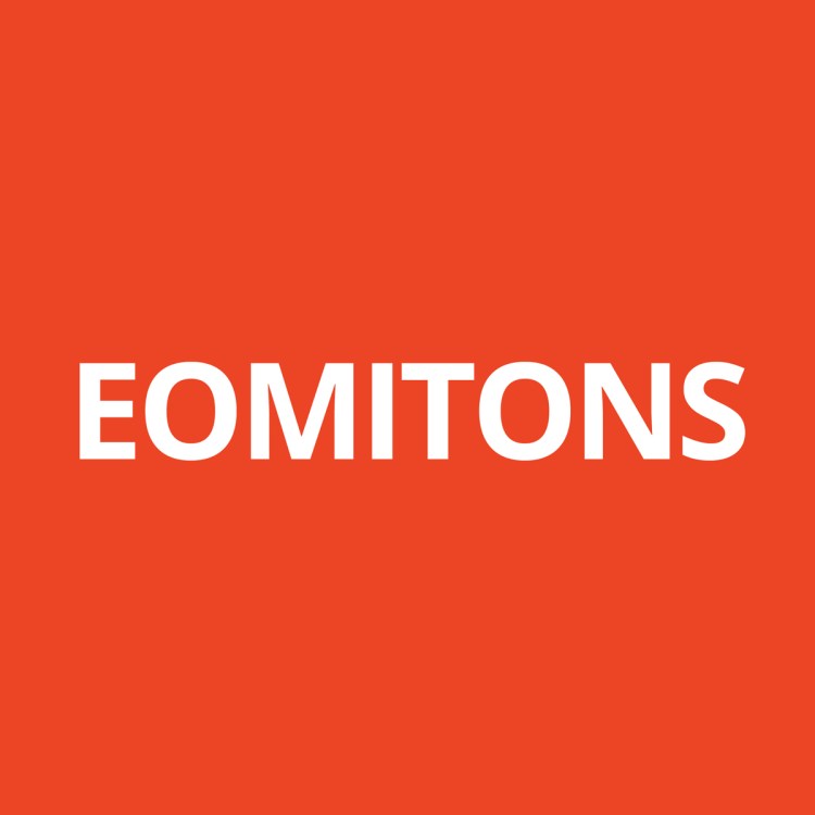
Emotions? 
Fast 
A Job? Anjob? 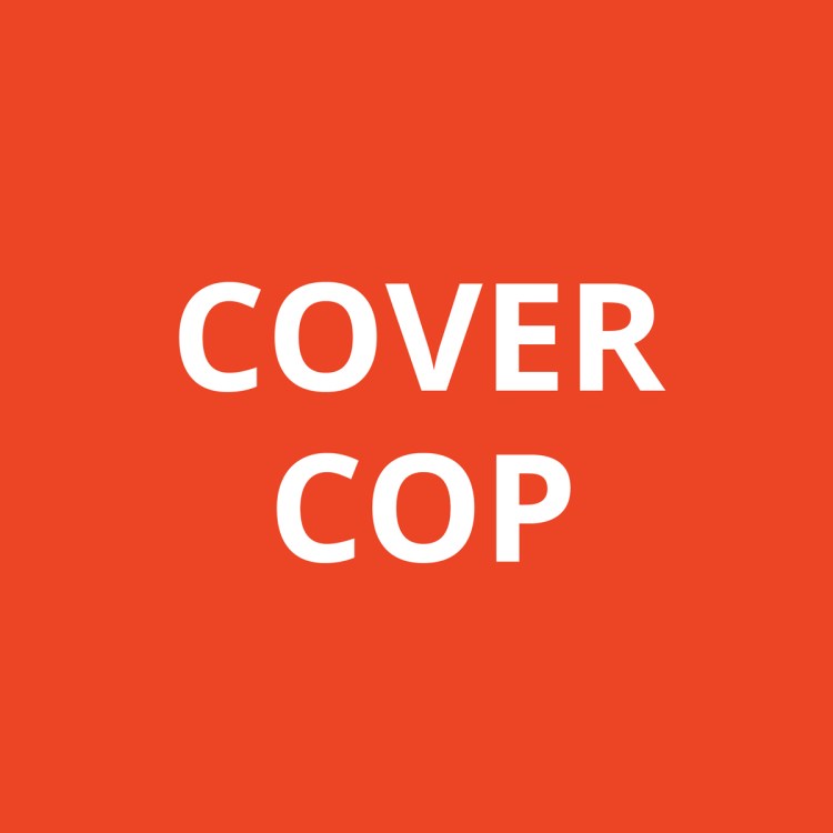
Cover Cops 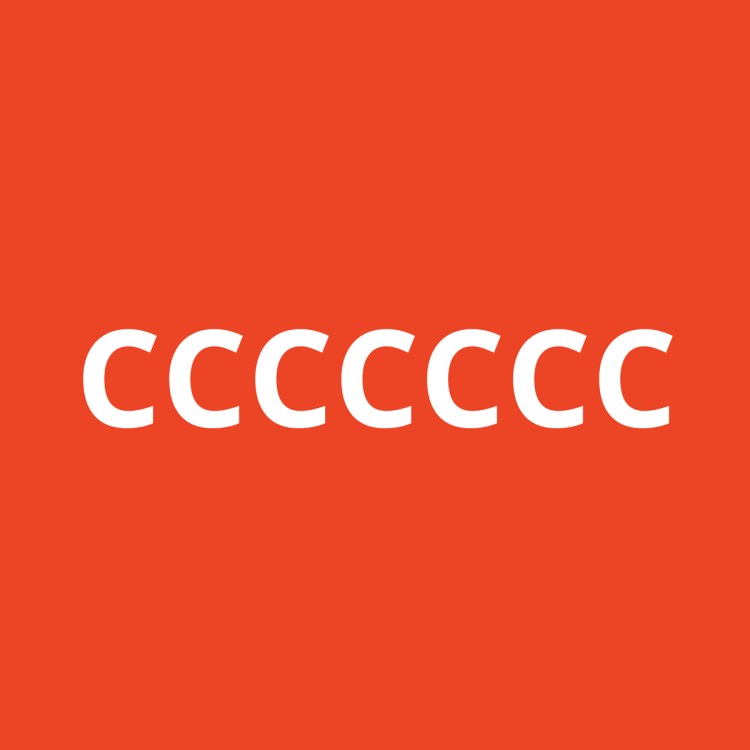
Septuple “C” 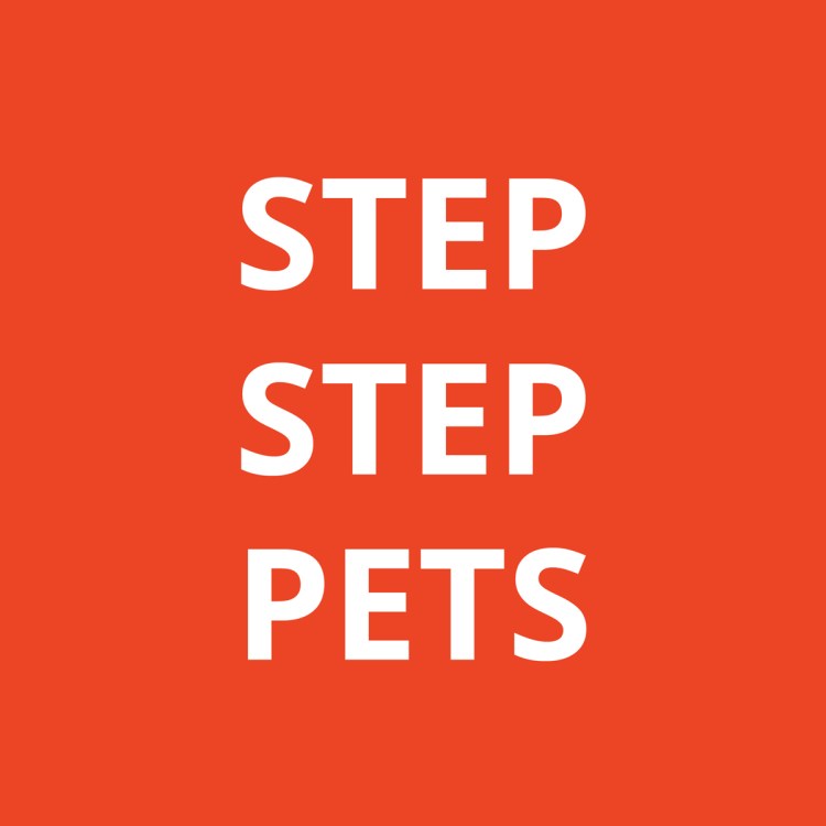
Pets is the word “Steps” backwards
The orange color is certainly chosen to catch our attention and the text is without seriff´s, meaning that there are no extra lines at the edges. I am personally struggling to understand what they are trying to communicate here. Sometimes a one-word slogan can convey a lot but here I am at a loss.
“Cover Cop” might be a reference to the “Grammar Nazis” on the internet that are correcting others’ spelling to an insane amount, so maybe it is trying to say that they do the same with covers? Or maybe it is a book series where one is an undercover cop and the word “Under” is on the other side?
Or maybe you are supposed to put them all together and see it as one story. Something involving a bottle, alcohol? Many emotions but can’t spell it because they are drunk. They drank it fast. They need a job. The undercover cop sees it. I don´t understand. A creative idea is good but if nobody understands, or makes the wrong conclusion, it is not the best to use as, for example, an ad. Then again I might just be an airhead here and miss the obvious. Has happened before.
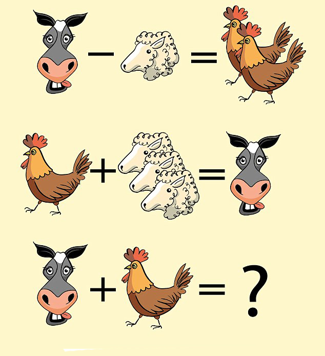
A Facebook Math Challenge? 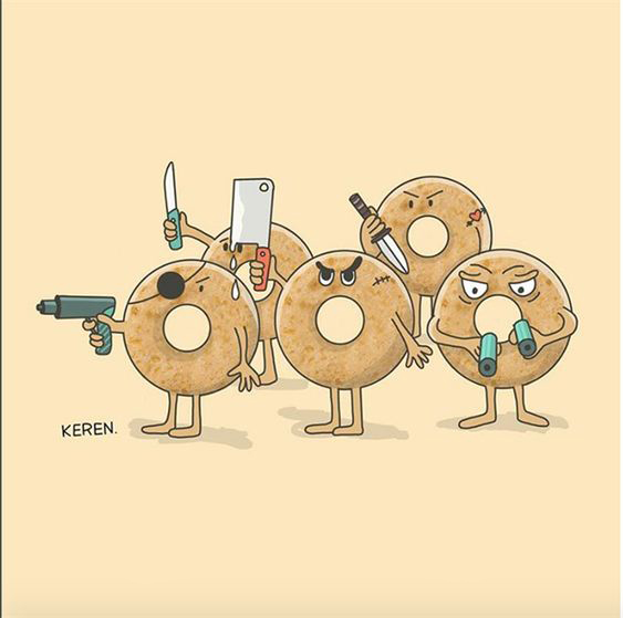
The Dougnuts Are Sick Of Being Eaten So Brutally 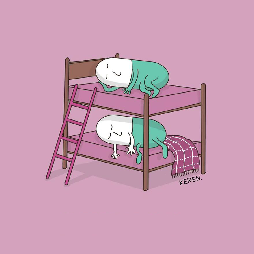
Sleeping pills? 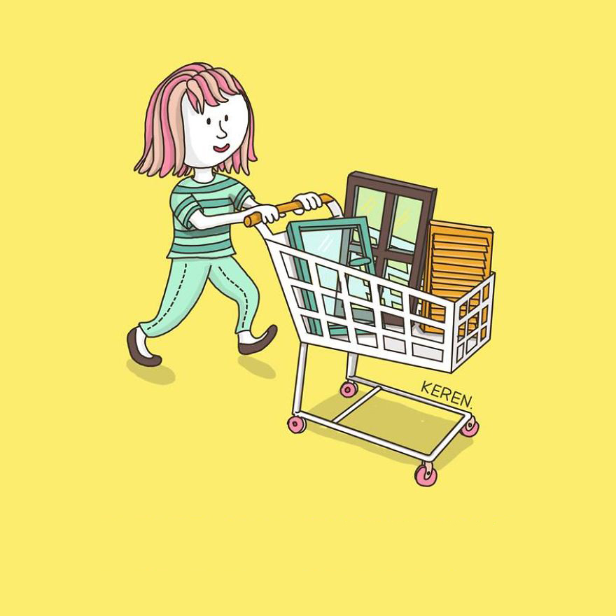
Is This A Domestic Lil Pump?
Now that I have given stupid titles to each picture I can talk about them and what I think they are trying to communicate. I don´t think most of these are very deep, but they are funny, easy to take in, and have a nice color palette.
I think the first one is trying to engage the viewer in remembering how to solve x(?)y= z tasks. The second one is simple humor about the food fighting back against their oppressors and creators with a revolution. The third one is sweet and shows two pills sleeping, straightforward, and nice to look at. I think it is trying to communicate about sleep. The last one is simply communicating that someone is buying different types of windows, they really remind me of Lil Pump, to be honest.
A thing they had in common was that there were no words used to convey their message and that the background color is catching, but not eye-burning. Neither sets of drawings and designs were bad. I am sure somebody would have preferred the orange ones with words to the ones I preferred, the drawings.
It comes down to taste and scary about creative thinking and products. And you can´t appeal to everyone and expect them to understand your way of thinking, especially if it is a totally new thing or your ideas jump from one place to the next. One thing I struggled with in high school was that my ideas were either boring and too simple, making it uninteresting, OR it was very creative but hard to follow or understand unless you were just like me. Therefore I am going to try and communicate with art using a notepad and pencil just like the Lesson Task told me to.
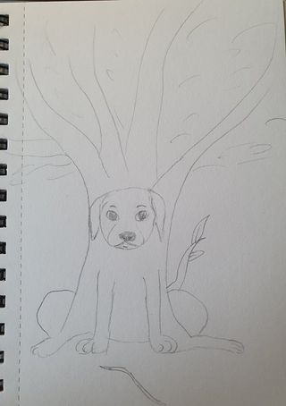
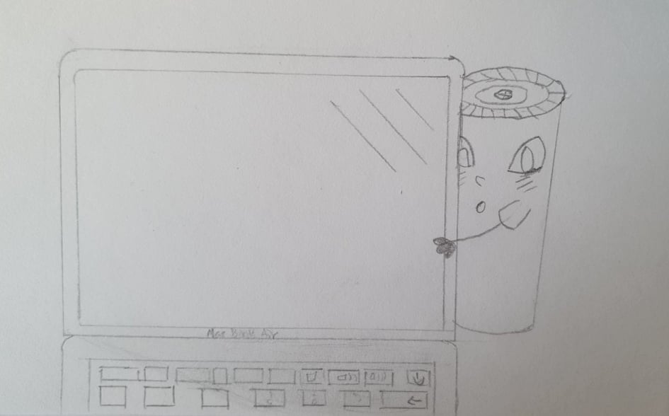
My two drawings where I tried thinking laterally. Dog tree (Dogwood) and a shy soda cup by my MacBook. When I drew these two I had completely different ideas in my mind. With Dogwood I had been inspired by others in the class and saw that they had seen the puns in “Sleeping pills” and went with that. On the soda cup, I looked around me and suddenly the idea of my soda cup having a crush on my MacBook went into my mind. It is also now that it hits me that the keyboard should be angled…
I am personally not good with puns etc. I can understand them if there is context but if they just appear I am not likely to catch it. I have gone to an art exhibition several times but it took someone pointing out one pun for me to understand that it was just a bunch of puns and figures of speeches. A whole art exhibition of puns and many figures of speech, and it took me at least 3 visits and one person explaining it to me.
1.2 Ideation
“Ideation is the creative process of creating new ideas. There are various ideation techniques out there; mind mapping, brainstorming, and sketching, to name a few. Use the Internet for research and choose three that you would like to try in the future or have used before. Describe how they work in no less than a paragraph.”
Brief explenation of the 1.2 Lesson Task.
My task seems to be to explain how I can and have used creative methods for new ideas. Well, my go-to technique is “Mind Mapping”. That is when you start with one word or concept in the middle and then draw branches out of that where you write what you think about when you hear or read that word. From then on you just continue branching out and you might eventually have the branches merge. Those are good points. A problem I face with that is that others might not always follow unless you show them the mind map with a colored “path”. A method similar (but different) to that is what I like to call “Vomit Bucket” where I just throw any idea coming into my mind into one place and try to string them together. Ideas that might not make sense are still put there because they might be useful later… or never. My third method is mad scribbling and such on paper or something similar and then using what is scribbled for new ideas. It is mindless and thus probably holds ideas or designs I have not thought of before. One part of the scribble might look like something and thus give me an idea.
1.3 SCAMPER Packaging
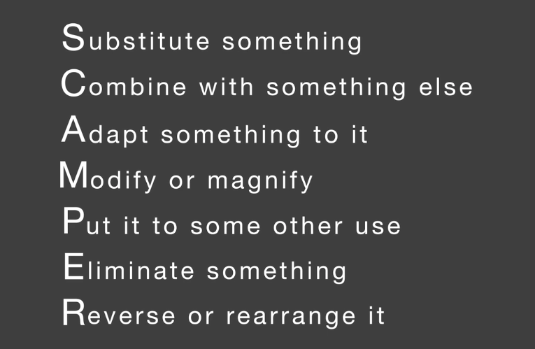
My task is to design the packaging of a lightbulb. It has to be different and thus I have to go through the SCAMPER method and see if there is a way to make the packaging new.
Substituting something in normal lightbulb packaging might be hard, the only thing that would make sense to substitute is the plastic “window” to see the lightbulb. Either removing it entirely or using vellum paper, a type of prepared animal skin used in ancient times to write on (and still in use). That or tracing paper, a type of paper that has low opacity. A type of netting could be used as well, holding the product in and still limiting how much the consumer can touch. Combining with something else within normal lightbulb packaging? Hmm, maybe combining it with a ruler? If the material is firm enough it can be used as a ruler if a ruler is drawn on the inside. Then there will be no necessity to buy plastic rulers, and it is cheaper than metal rulers. Two birds, one stone.
Adapting something to the packaging. I would adapt it to be smaller and thus take less space in storage. Modifying the instructions or other extra info, to be on the inside of the cardboard instead of its own manual, would save resources. Putting it to some other use fits well with my ruler idea, but we can also market it to be useful as a beehive after usage. Promoting the goodness of reusing packaging. The same was done with cartons for beverages. Encouraging people to use it as a birdhouse for small tits might also be possible.
Eliminating the plastic (or vellum or tracing paper) window is another way to save resources. Either leave it open for the consumers to see the product with their own eyes, or just not have any openings and have a complete box. This can prevent damage to be done to the product. Reversing or rearranging an aspect of the usual lightbulb packaging would be difficult since they are not that complex. The logo and/or product name at the front with details at the back. We could make the details at the top lid, but then it has to be in such a way that it is not destroyed easily when the package is opened.
The final part of this task is to draw down a possible lightbulb packaging. I decided that combining and eliminating certain aspects was the most interesting and resource-friendly idea. Sure, making a ruler on the inside uses ink, however, it is something new and the brand will be recognized for it. Even if by a little margin. I did not choose any more of my SCAMPER ideas since I did not want my product to have too much going on. Simple is at times better.
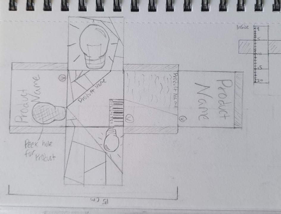
A sketch of potential lightbulb packaging.
The lightbulb packaging I was designing is a box where each side is 5x5cm with a peek hole to see the product through. Panel 1 has the product name and the peephole, including a circled V (supposed to be W, my bad) that stands for the strength of the bulb. You know, general info. The most important bit. Panel 2 has the barcode, product name, and some modern design on it. The design that seems to be “in” right now is tons of geometric shapes put together, more specifically triangles, squares, and rectangles.
Panel 3 contains the most important info about the lightbulb with the Watt circled once again. The product name is displayed at the top again. It is after all one of the most important parts to show. Panel 4 is the lid of the package, and the product name and Watt are displayed once again. The side panels next to panel 2 have illustrations of shining lightbulbs to show what the product is and is supposed to look like when active.
The inside of the entire box is different from the usual lightbulb boxes. It has a simple foldable cardboard ruler inside of it. It is a small extra step but it is new and might land well with the consumers. My ruler idea is more of a test to see how it would work so it is a hit or miss.
I can feel content with what I have made at the moment so, Happy Halloween.
Student and Designer
